Author: onetwothreeadmin

  • How to start an email newsletter in 2026 — without giving the platform a 10% cut

    How to start an email newsletter in 2026 — without giving the platform a 10% cut

    Last week Ali Abdaal published a 14-minute video called How to Start an Email Newsletter. It is a good primer: why a newsletter is the easiest creator project to start, what to write about when you have no idea what to write about, and a three-platform walkthrough at the end (ConvertKit, Revue, Substack).

    The first two-thirds hold up perfectly. The third-act platform recommendation is where we want to add something. Revue closed in 2023. Substack still works but it owns the relationship between you and the people who read your writing. There is a better default in 2026: write the newsletter on your own WordPress site using a free plugin, and you keep the subscriber list, the email addresses, the design, and the URL forever — even if you change tools next year.

    This is that walkthrough.

    Part 1: Why you might want a newsletter in the first place

    Ali makes five arguments, and they all stand up:

    It is free to start. Unlike a YouTube channel — which needs at least a phone, decent lighting, and the courage to film yourself talking to no one — a newsletter is just an email. You type, you send. There is no production setup.

    It is low-friction. Most people who freeze when starting a creator project freeze because the first step is hard. With a newsletter the first step is “write a paragraph and click send”. If you can write a long text message you can write a newsletter.

    It is private until you want it to be public. There is no algorithm pushing your newsletter into anyone’s feed. Your first ten issues can go to your mum and one friend and that is fine. You get to practice the craft of writing for an audience before there actually is an audience. YouTube does not give you that grace period.

    You own the audience. An email address is the closest thing the internet has to a direct line. The reader has explicitly given you permission to show up in their inbox, and you can unsubscribe with one click — which means anyone who stays is choosing to be there every single week. That is much more valuable than a follower count on a platform that can change its algorithm tomorrow and bury your work.

    It can become an asset. Ali wrote his Sunday Snippets newsletter for three and a half years before he made any direct money from it. Now individual sponsor slots go for $5,000–$7,000. Morning Brew started as a daily email written by Alex Lieberman in his university dorm room; five years later he sold it for $70 million. The point is not that your newsletter will sell for $70 million. The point is that a newsletter that nobody pays for today can quietly become a real business in three years, without you having to bet your career on it now.

    Part 2: What to write about (or: the only question that actually stops people)

    The wall most people hit is not “I do not know how to type”. It is “I do not know what I would even write about”. Three responses to that:

    Write about whatever you find interesting. If you genuinely enjoy writing Harry Potter fanfiction, write three paragraphs of Harry Potter fanfiction every Sunday. The reason this matters is not the topic — it is that intrinsic motivation is the only thing that keeps you consistent in the first year, when nobody is reading. Consistency is the secret. If you are doing it for the love of the craft, you keep going. If you are doing it for the money, you quit when the money does not appear by month three.

    Curate. Tim Ferriss runs one of the largest newsletters in the world — Five Bullet Friday — and the entire format is “five things I enjoyed this week”. A book, a podcast, a gadget, an article. You almost certainly consume stuff during the week that other people would benefit from. Send them a list.

    Pick a topic. Morning Brew is just “what’s happening in business and tech, told entertainingly, every weekday morning”. If you are genuinely interested in something, there are almost certainly other people who would like to be kept up to date on it without having to find the sources themselves.

    All three work. None of them require you to be an expert. They require you to write the thing every week.

    Part 3: How to actually start one — without giving the platform a permanent cut

    Here is where we depart from Ali’s video. He recommends Substack as the default for someone starting from scratch. Substack is fine for a first draft, but it has two long-term problems:

    • 10% of every subscription, forever. The moment your newsletter starts making money, Substack takes 10% off the top. On a healthy paid newsletter that is real money — a thousand subscribers at $8/month is $9,600 a year going to a platform you do not need by year two.
    • It is their URL, their design, their brand. Your newsletter lives at yourname.substack.com with their header, their fonts, their suggested-newsletters block at the bottom of every email. Migrating off later is possible — but you lose a lot of the SEO and brand equity you have built.

    The alternative: run your newsletter from a WordPress site you already own, with a plugin called One Two Three Send. Free, no revenue share, no platform lock-in, no algorithm-driven sidebar. Your domain, your design, your subscriber list — yours in the literal sense that they live in a database table on your own host.

    Five minutes from zero to a sent newsletter

    1. Install the free plugin. WordPress admin → Plugins → Add New → search “One Two Three Send” → Install → Activate. Or grab it directly from wordpress.org/plugins/one-two-three-send.
    2. Pick how emails actually get sent. Newsletter → Settings → Email Provider. Resend (free for first 3,000 emails/month, simple API key paste) or SMTP (any provider including Amazon SES, MailerLite, Brevo, Mailchimp). Pick one, paste credentials, save.
    3. Drop a signup form somewhere. Newsletter → Signup Forms gives you a default form on first activation. Embed it on your homepage with

      The newsletter for newsletter operators

      Daily field notes on deliverability, AI tools, hosting, and monetisation. No "top 10 plugins" filler — real tools, real numbers, real failures.

      , or use the Gutenberg block. Done.
    4. Write the first issue. Newsletter → New Newsletter. Type something. Click Run audit (the plugin checks the obvious mistakes — missing unsubscribe link, dodgy subject line length, broken placeholders, spam triggers). Click Send.
    5. Your first subscriber is you. Add your own email through the Subscribers tab so you can see what arrives. Send the first issue. Open it. Forward it to your mum.

    That is the entire free plugin. It is enough to run a real newsletter for as long as you want. The whole “I do not know what platform to start on” friction goes away because you are writing inside the same WordPress admin you would use to write blog posts.

    When you outgrow the free tier

    Ali talks about the moment a newsletter starts to make money — sponsors, a course, a paid tier. That is the moment Substack quietly starts charging you 10%. With One Two Three Send the upgrade path is a companion plugin called One Two Three Send Pro, distributed to subscribers of our own newsletter. What it adds maps directly to the use cases Ali mentions in the video:

    • Stripe paywalls for paid subscribers, with no revenue share to anyone. You set the prices, Stripe charges, the money goes to your bank account. We see the metadata to flip the free/paid flag on a subscriber row; we never see the payment itself.
    • AI newsletter generator using your own Claude API key. This is the practical answer to “what should I write about this week” — Claude drafts from your site’s recent posts, your tagline, and a manual description of your voice. You edit. You send. The cost per issue is a few cents of Claude tokens, paid directly to Anthropic.
    • Welcome email + lead magnet delivery on every signup, completely automatic. A new subscriber gets a personalised “thanks for signing up, here is your free PDF” email within seconds of the form submission.
    • More email providers — Mailchimp, MailerLite, Brevo, ConvertKit, Amazon SES on top of Resend and SMTP. Pick the one your audience already trusts.
    • Newsletter Network — opt-in cross-promotion ring of other One Two Three Send sites. Drop a small widget on your blog posts, your readers see other newsletters, their readers see yours. It is the closest thing to an algorithm a self-hosted newsletter has, and it costs you nothing except the screen space at the bottom of a blog post.
    • Pre-send audit with five extra Claude-powered checks on top of the free plugin’s ten — tone match, opening hook, structure, call-to-action strength, subject-vs-body alignment. Catches the issues that make sends embarrassing in retrospect.

    The pricing model for Pro is intentionally simple: it is bundled with the paid tier of the publication you are reading right now, so there is no separate marketplace, no separate licence key, no separate billing. See pricing if you are curious.

    The honest summary

    Ali’s video is right about the why and right about the what. The free plugin we make is just a different answer to the how — one where the subscriber list, the URL, the design, and the future revenue all belong to you, and the only thing we ever bill you for is the optional Pro upgrade that does not change who owns the relationship.

    If you watched the video and felt the itch to start, do not over-think the platform decision. You can start on Substack tonight and migrate later if it works out — we have a CSV-import path that takes ten minutes. Or you can start on your own WordPress site tonight and skip the migration entirely. Either way, the part that matters is writing the first issue this week.

    Hit reply on any of our issues once you have sent yours. We read every one.

    Heads up — some links in this article are affiliate links. If you sign up through them, we may earn a small commission at no extra cost to you. We only recommend tools we use ourselves.


  • Gumroad’s variant pricing: when to use it and when it confuses buyers

    Gumroad’s variant pricing feature lets you offer multiple versions of the same product—different formats, license tiers, or access levels—without duplicating product pages. A single URL can serve a $9 PDF, a $49 video bundle, and a $199 commercial license.

    The mechanic is simple: buyers see a dropdown or radio buttons before checkout. Pick a tier, click buy, done.

    In practice, it’s more nuanced than that. Variants can increase average order value when implemented well, or create decision paralysis when overdone. The difference comes down to how you structure the choice and what you’re actually selling.

    How Gumroad’s variant pricing actually works

    When you create a product in Gumroad, you can add variants under the pricing section. Each variant gets its own name, price, and optional description. You can also attach different files to each variant—so a “basic” tier delivers a PDF, while a “pro” tier adds video files and templates.

    Gumroad handles fulfillment automatically. The buyer selects a variant, pays, and receives only the files attached to that specific option. You’re not manually sorting orders or sending different download links.

    The feature supports up to 100 variants per product, though you’ll never need that many. Most successful Gumroad creators use two to four.

    Variants appear on your product page as a selection interface. You control the display style—dropdown menu, radio buttons, or cards with images. The card layout works best for visual products where the difference between tiers is obvious at a glance (e.g., template packs with different color schemes). Radio buttons work for straightforward upgrades like “personal use” vs. “commercial license.”

    When variants increase revenue

    Variants perform well when the upgrade path is clear and the value gap is obvious. A few patterns that work:

    License tiers. Selling design assets, templates, or stock content? Offer a personal-use license at $19 and a commercial license at $79. The buyer self-selects based on need, and you capture budget from both hobbyists and agencies without splitting your audience across multiple product pages.

    Format bundles. If you’re selling educational content, offer the written guide alone, then add video walkthroughs or editable templates at higher tiers. The base product proves value; the upgrades save time. A $29 PDF guide might convert at 4%, while adding a $79 “PDF + videos” variant brings total revenue up 30% even if only 15% of buyers choose it.

    Quantity-based pricing. This works for freelancers selling assets in packs. Ten social media templates for $15, fifty templates for $49. The per-unit savings are obvious, and buyers with larger needs convert themselves into higher-value customers.

    The key commonality: the base variant is a complete, valuable product. The upgrades are enhancements, not necessities. If the cheapest option feels incomplete, you’ve built a paywall, not a product ladder.

    When variants create friction instead

    Too many options kill conversions. If a buyer lands on your product page and sees seven variants with unclear differences, they’ll leave to “think about it”—which means they won’t come back.

    Avoid variants when:

    • The differences are cosmetic or arbitrary. Offering the same ebook in three different PDF layouts doesn’t add value; it adds confusion. Consolidate.
    • You’re trying to price-discriminate without clear tiers. Listing a product at $9, $12, $15, and $19 with vague labels like “supporter pricing” doesn’t work. Buyers assume the $9 version is incomplete or lower quality. If you want to let people pay more, use Gumroad’s “pay what you want” feature with a suggested price instead.
    • Your audience doesn’t understand the distinction. Selling “standard resolution” vs. “high resolution” images? Great if you’re targeting designers. Confusing if your buyers are small-business owners who don’t know what DPI means. Meet your audience where they are.

    One variant mistake I see often: “basic,” “pro,” and “ultimate” tiers where the feature list for each is buried in fine print. If someone has to read three paragraphs to understand what they’re buying, simplify the structure or split into separate products.

    The non-obvious tip: test your variants with SKU tracking

    Gumroad doesn’t surface variant-level analytics in the main dashboard. You see total sales and revenue, but not a breakdown of which variant is actually driving volume.

    Workaround: treat each variant as its own SKU in your spreadsheet or analytics tool. Export your sales CSV monthly, filter by variant name, and track conversion rate and revenue independently. You’ll often find that one variant accounts for 70% of revenue while another sits unused. That’s actionable data—either kill the underperformer or reframe it.

    If you’re running paid traffic to a Gumroad product, append UTM parameters to your links and cross-reference them with variant sales in your export. You’ll see which traffic sources prefer which tiers, and you can adjust your ad creative accordingly. A Facebook ad highlighting affordability might drive base-tier sales, while a Twitter thread showcasing advanced features could skew toward your top variant.

    Gumroad’s variant pricing works best when it reduces decision fatigue rather than creating it. Two or three well-differentiated options, clear value at every level, and a single product page that doesn’t require a comparison chart to navigate. Get that right, and you’ll see higher average order values without fragmenting your catalog.

    Using Gumroad for your digital products, courses, or templates? Reply with your toughest pricing question—I’ll cover it in a future issue.

  • Ahrefs’ traffic value metric: what it measures and why it misleads

    Ahrefs’ traffic value metric: what it measures and why it misleads

    Ahrefs displays a “Traffic Value” number next to every domain and page it crawls. It’s supposed to represent the dollar value of your organic search traffic—what you’d pay in Google Ads to get the same visits.

    It’s a seductive metric. A single number that turns traffic into money. But if you’re using it to prioritize content, justify your SEO work, or benchmark against competitors, you’re probably making decisions on bad data.

    Here’s how the metric is built, where it works, and where it falls apart.

    How Ahrefs calculates traffic value

    Ahrefs estimates how much traffic each page receives from organic search, then multiplies that traffic by the estimated cost-per-click (CPC) for each keyword the page ranks for. The sum is your traffic value.

    The formula is straightforward:

    • Identify the keywords a page ranks for
    • Estimate monthly search traffic for each keyword
    • Pull the CPC for each keyword from Google Ads data
    • Multiply traffic by CPC for each keyword, then sum it up

    If your blog post ranks for “best project management software” and gets 500 visits a month, and the CPC for that keyword is $18, Ahrefs assigns that page a traffic value of $9,000 per month.

    On the surface, it makes sense. You’re getting traffic you’d otherwise pay for. But the math only holds if three assumptions are true—and they rarely are.

    Where the metric breaks down

    First, CPC data reflects advertiser intent, not organic visitor intent. Someone searching for “Asana pricing” and clicking an ad is much closer to a purchase decision than someone clicking an organic result. Organic traffic from the same keyword converts at a lower rate, often dramatically so. Ahrefs doesn’t adjust for this.

    If you’re ranking for high-CPC keywords in the B2B SaaS space—think “enterprise CRM” or “compliance software”—your traffic value will look enormous. But if those visitors are researchers, students, or early-stage browsers, the actual revenue impact is a fraction of what the metric suggests.

    Second, the metric assumes you’d actually run ads for those keywords. Many high-traffic, high-CPC terms make no sense to advertise on. Informational queries, branded searches for competitors, and bottom-of-funnel terms you’d never bid on all inflate your traffic value without reflecting real alternative cost.

    If your site ranks for “what is SEO,” Ahrefs might assign that traffic a high value because someone, somewhere, bids on it. But you’d never pay for that click. It’s not replacing ad spend; it’s just free traffic with a made-up price tag.

    Third, CPC varies wildly by geography, device, and time. Ahrefs uses averaged CPC data, often U.S.-focused. If your traffic is global, mobile-heavy, or concentrated in lower-CPC regions, the metric overstates value. A $12 CPC keyword in the U.S. might be $2 in India, but Ahrefs doesn’t break that out in the top-line number.

    When traffic value is actually useful

    Despite its flaws, the metric isn’t useless. It works well in a few specific contexts.

    Competitor research: If you’re comparing your site to a direct competitor in the same niche, traffic value gives you a rough sense of whose organic footprint is larger. The absolute number is still inflated, but the relative difference is directionally useful.

    Content prioritization: When you’re deciding which existing pages to update or expand, traffic value can highlight pages that rank for commercially valuable keywords but aren’t fully optimized. Just don’t treat the dollar figure as literal revenue.

    Executive reporting: If you need to communicate SEO impact to a non-SEO audience, traffic value translates organic performance into a language finance teams understand. Just be transparent about what it represents—avoided cost, not actual revenue.

    What to use instead

    If you’re trying to measure the business impact of organic traffic, skip traffic value and go straight to the metrics that matter.

    Track conversions by landing page in Google Analytics 4 or your CRM. Filter for organic traffic, then see which pages drive signups, purchases, or qualified leads. That’s the actual value, not a CPC proxy.

    Use Ahrefs’ traffic estimate on its own, without the dollar value. Pair it with your own conversion data to calculate real revenue per page. If a page gets 1,000 visits a month and converts at 2% to a $50 product, that’s $1,000 in monthly revenue—far more useful than a synthetic traffic value of $3,400 based on CPC data from advertisers in a different market.

    If you’re evaluating content opportunities, look at keyword difficulty, search intent, and your own conversion rates for similar topics. Traffic value might tell you a keyword is “worth” $5,000 a month, but if it’s impossible to rank for or attracts the wrong audience, the number is fiction.

    Ahrefs’ traffic value is a shortcut. It’s helpful when you need a quick, rough signal. But the moment you start optimizing for it, or using it to justify budget or strategy, you’re optimizing for a number that doesn’t reflect how your business actually makes money.

    Measure what converts. Everything else is just math.

    Got a metric you’re not sure how to interpret? Reply to this email—we’ll cover it in a future issue.

  • Zapier’s filter step vs. paths: when to branch and when to block

    Zapier’s filter step vs. paths: when to branch and when to block

    Zapier gives you two ways to handle conditional logic: filters and paths. They sound similar—both let you control what happens based on specific conditions—but they work differently, cost differently, and solve different problems.

    If you’ve ever built a Zap that runs but does nothing, or one that burns through tasks faster than expected, you’ve probably picked the wrong tool for the job.

    What filters do (and when they’re the right choice)

    A filter is a checkpoint. It evaluates a condition and either lets the Zap continue or stops it immediately. If the condition isn’t met, the Zap ends—no further steps run, and Zapier counts it as a task used.

    Filters work best when you want to exclude certain triggers from running the rest of your workflow. For example:

    • Only send a Slack notification if a form submission includes “urgent” in the subject line
    • Only add a contact to your CRM if their email domain isn’t gmail.com or yahoo.com
    • Only log a new row in Google Sheets if the order total is above $100

    The key trait: you’re saying “if this isn’t true, do nothing.” You’re not offering an alternative action—you’re just stopping early.

    One non-obvious benefit: filters are psychologically clean. When you review a Zap history and see tasks that were filtered out, you know exactly why they didn’t proceed. There’s no ambiguity, no hidden branch you forgot about.

    What paths do (and when you need them instead)

    Paths let your Zap fork into multiple routes based on conditions. Each path can have its own set of actions, and Zapier will execute only the path whose conditions are met. If none match, the Zap can either stop or fall through to a default path.

    Paths are the right tool when you want to route a trigger to different outcomes. For example:

    • If a new subscriber chooses “weekly digest,” add them to MailerLite list A; if they choose “daily brief,” add them to list B
    • If a support ticket is tagged “billing,” create a Stripe invoice; if it’s tagged “technical,” post to a dev Slack channel
    • If a Typeform response selects “enterprise,” send to your CRM and notify sales; if it selects “self-serve,” send a welcome email via Postmark

    The structure is “do X if A, do Y if B”—not “do X or do nothing.”

    Paths count as one step in your Zap, but each action inside a path counts separately toward your task limit. If you have three paths and only one executes, you’re only billed for the actions in that path—not all three.

    The mistake that burns tasks: using paths when a filter would do

    Here’s the pattern I see most often: someone builds a Zap with two paths. Path A has five actions. Path B is empty, labeled “Do Nothing.”

    That’s a filter dressed up as a path. And it’s wasteful.

    Every time the Zap runs, Zapier evaluates the path logic—even if the result is to do nothing. You’re adding complexity and making your Zap history harder to read. Worse, if you later add actions to Path B “just in case,” you risk doubling your task usage without realizing it.

    The fix: if one outcome is “do nothing,” use a filter instead. Reserve paths for workflows where every branch does something.

    How they affect your task count (and your bill)

    Both filters and paths count as tasks, but in different ways.

    A filter counts as a task every time the Zap runs, even if the filter stops it. If 100 triggers come in and 90 are filtered out, you’ve used 100 tasks—because Zapier had to evaluate all of them.

    A path counts as one task for the path step itself, plus one task for each action that runs inside the chosen path. If you have a three-path Zap and only one path executes two actions, you’ve used three tasks total (path evaluation + two actions).

    This means paths can be more efficient if you’re routing high-volume triggers to different outcomes. But if you’re just trying to exclude certain triggers, a filter up front will keep your history cleaner—even if the task count is the same.

    One rule of thumb that makes the decision easy

    Ask yourself: if this condition isn’t met, should something else happen, or should nothing happen?

    If the answer is “nothing,” use a filter.
    If the answer is “something else,” use paths.

    That’s it. You don’t need to overthink routing logic, task costs, or Zap readability. That one question will steer you to the right tool almost every time.

    Got a Zapier workflow that’s burning tasks faster than expected? Subscribe to One Two Three Send and get one operator-focused automation breakdown every week—no fluff, no beginner tutorials, just the details that matter when you’re running a real business.

  • Google Search Console’s Discover report: hidden traffic you’re missing

    Google Search Console’s Discover report: hidden traffic you’re missing

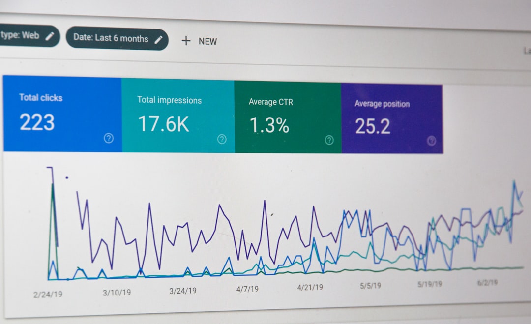
    Most solo operators check Google Search Console for keyword rankings and click-through rates. They skim the Performance report, maybe filter by a few landing pages, then move on. Meanwhile, there’s a second traffic source sitting in the same dashboard that most people never open: the Discover report.

    Google Discover is the feed that appears when you open a new tab on Chrome mobile or swipe right on Android home screens. It’s algorithmic, personalised, and—when it picks up your content—capable of sending thousands of visits in a single day. Unlike search traffic, you don’t rank for it. Google decides what to show based on user behaviour, topic velocity, and content freshness.

    If you’ve never checked your Discover report, you’re flying blind on a traffic source that could already be working for you—or that you’re one article away from unlocking.

    Where to find it and what it shows

    In Google Search Console, the Discover report lives under the main navigation, separate from the Performance tab. If you don’t see it, that means Google hasn’t logged any Discover impressions for your site in the last 16 months. That’s not a failure—it just means your content hasn’t triggered the algorithm yet, or your audience demographic skews desktop-heavy.

    If the report is there, you’ll see impressions and clicks broken down by URL and date. Unlike search traffic, there are no keywords. Discover doesn’t work that way. Users don’t query; Google surfaces content it thinks they’ll engage with based on past behaviour and trending topics.

    The chart will show spikes—sometimes dramatic ones. A single article can go from zero Discover impressions to 40,000 in 48 hours, then drop back to nothing. That’s normal. Discover traffic is bursty and short-lived, unlike the steady climb of organic search.

    What triggers Discover traffic

    Google hasn’t published a scoring rubric, but patterns emerge when you compare performing URLs. Discover favours:

    • Recency. Articles published or updated in the last 72 hours perform better. Evergreen content rarely appears unless it’s tied to a breaking news hook.
    • High-quality images. Google explicitly recommends large images (at least 1200px wide). Articles without featured images or with low-resolution thumbnails get filtered out.
    • Topics with momentum. If a subject is trending across the web—new product launches, regulatory changes, viral discourse—Discover amplifies it. Niche topics with low search volume can still perform if the zeitgeist is right.
    • Engagement signals. If users who do see your content in Discover click, read, and don’t bounce immediately, Google shows it to more people. If they swipe past, it dies.

    Crucially, Discover doesn’t care about your domain authority or backlink profile the way search does. A two-month-old site can land in Discover if the content and timing align. That makes it one of the few Google traffic sources where new operators compete on roughly equal footing.

    How to use the data

    If you are getting Discover traffic, the report tells you which topics and formats resonate outside of search intent. Compare your top Discover URLs to your top search URLs. If they don’t overlap, you’ve found a content wedge: topics that people engage with when surfaced passively, even if they’re not actively searching for them.

    Check the date pattern. If your Discover traffic clusters around publication day and fades within a week, that’s a signal to publish more frequently in that topic area. Discover rewards freshness, so a higher cadence gives you more at-bats.

    If a specific article spiked, look at what made it timely. Did you tie it to a news event? A product launch? A meme cycle? Discover isn’t a place for evergreen SEO content—it’s a feed, and feeds thrive on the new.

    One non-obvious move: if you’re seeing Discover impressions but low click-through, your image or headline isn’t pulling its weight. Discover users scroll fast. Your thumbnail needs to stop the thumb, and your headline needs to justify the tap. Test different featured images and headline styles in future posts. Discover traffic is free A/B testing for visual appeal.

    What it means if you’re not in Discover yet

    Most content sites won’t see Discover traffic, and that’s fine. It’s not a requirement for a healthy business. But if you’re publishing timely, visual content in areas where people have passive interest—tech releases, industry news, cultural commentary—it’s worth optimising for.

    The barrier to entry is lower than you think: add large images, publish when a topic is moving, and make sure your site is mobile-friendly. Google’s more likely to surface you in Discover if your content works well on the platform where Discover lives—phones.

    If you want to see whether you’re close, check your Search Console Discover report monthly. Even a handful of impressions means Google is testing you in the feed. If those impressions convert to clicks, the algorithm may start showing you more often.

    Want sharper insights on traffic, tools, and online-business operations? Subscribe to One Two Three Send and get one focused article like this in your inbox every week.

  • Pinterest’s API limits and when your automation will break

    Pinterest’s API limits and when your automation will break

    Pinterest automation feels like free traffic on autopilot—until your scheduler stops working, your pins vanish from the queue, and you’re staring at a 429 error you don’t understand.

    Most operators treat Pinterest like any other social platform: connect a tool, load up a queue, walk away. But Pinterest’s API has hard limits that aren’t advertised in the onboarding flow, and hitting them doesn’t just pause your posts—it can flag your account, break your integrations, and cost you weeks of momentum.

    Here’s what actually happens when you automate Pinterest, where the boundaries are, and when you should schedule manually instead.

    What Pinterest’s API actually restricts

    Pinterest doesn’t publish exact rate limits for third-party tools, but the practical threshold sits around 30–50 API calls per hour for most standard-tier apps. That sounds generous until you realize what counts as a call:

    • Creating a pin
    • Editing a pin description or board assignment
    • Checking pin status or analytics
    • Fetching board lists
    • Validating image URLs

    If you’re using Tailwind, Buffer, or any scheduler that pre-validates images and checks boards before posting, you’re burning 3–5 API calls per scheduled pin—even if it hasn’t published yet. A 30-pin weekly queue can hit the hourly cap before a single post goes live.

    When you cross the threshold, Pinterest returns a 429 “Too Many Requests” error. Most tools retry automatically, which triggers more API calls, which extends the lockout. You won’t get an email. Your posts just stop.

    Where automation breaks down (and doesn’t recover gracefully)

    The worst part isn’t the rate limit—it’s how poorly most tools handle it.

    Tailwind will retry failed pins for 24 hours, burning API calls on each attempt. If you’re near the limit, those retries can block your entire queue for days. There’s no user-facing dashboard that shows you’re rate-limited; pins just show as “pending” indefinitely.

    Buffer pauses the Pinterest connection entirely after repeated 429s, but doesn’t always notify you. You’ll discover it when you check your analytics and realize nothing posted for a week.

    Zapier and Make (formerly Integromat) treat Pinterest API errors as temporary failures and retry aggressively—up to the task limit of your plan. If you’re auto-pinning from an RSS feed or Airtable, a single rate-limit event can consume your entire monthly task allowance in 48 hours.

    None of these tools let you see your API usage in real time. You’re flying blind until something breaks.

    What works: batch scheduling and off-peak windows

    If you’re committed to automation, the fix isn’t a better tool—it’s a tighter schedule.

    Spread your pins across the week instead of loading a 50-pin queue on Monday morning. Pinterest’s API limits reset hourly, so spacing posts 90–120 minutes apart keeps you under the threshold even if your tool pre-validates aggressively.

    Schedule pins during off-peak hours—early morning or late evening in your tool’s server timezone (usually US Pacific). Fewer concurrent users means fewer shared API requests hitting Pinterest’s backend, and you’re less likely to get lumped into a rate-limited batch.

    Turn off auto-retry in tools that support it. Tailwind lets you disable automatic rescheduling under Settings → Publishing. Buffer doesn’t, which is why I stopped using it for Pinterest entirely.

    If you’re using Zapier, add a delay step of 5–10 minutes between trigger and Pinterest action. It won’t eliminate rate limits, but it reduces the chance of bunching requests during high-traffic windows.

    When to skip automation and schedule manually

    Automation makes sense if you’re pinning 10–15 times per week and your content library is stable. But if you’re in any of these scenarios, manual scheduling is faster and more reliable:

    • You’re launching a new board or product line and need to pin 20+ items in 48 hours
    • You’re running a seasonal promo and need same-day pin edits
    • Your Pinterest account is under 6 months old (newer accounts have tighter API limits during the trust-building phase)
    • You’re using a free-tier automation tool that shares API quota across all users

    Pinterest’s native scheduler is clunky, but it doesn’t count against API limits and posts immediately—no validation lag, no retry loops. For high-volume bursts, it’s the only reliable option.

    One tool that handles this better

    If you’re scheduling more than 20 pins per week and need automation, Publer is the only tool I’ve found that surfaces API errors in the dashboard and lets you set custom retry intervals. It’s not an affiliate relationship—it’s just the only scheduler that treats Pinterest’s API limits as a design constraint instead of an edge case.

    Pricing starts at $12/month for 10 social accounts, including Pinterest, and the free tier supports 10 scheduled posts. Not enough for most operators, but enough to test whether your posting cadence will trigger rate limits before you commit to a paid plan.

    If you’re already locked into Tailwind or Buffer, the workaround is simple: cut your weekly queue in half, double your posting intervals, and check your scheduled posts 24 hours after loading them. If anything shows “pending” past the scheduled time, you’ve hit the limit.

    Want more breakdowns like this? Subscribe to One Two Three Send for tool deep-dives, workflow fixes, and the operational details other newsletters skip.

  • ConvertKit’s creator network: how it works and what it actually costs

    ConvertKit’s creator network: how it works and what it actually costs

    ConvertKit’s Creator Network is a cross-promotion engine built directly into the platform. Turn it on, and ConvertKit will recommend your newsletter to readers of similar publications—and recommend others’ newsletters to yours. It’s framed as free, mutual growth. No ad spend, no landing pages, just algorithmic matchmaking between creators.

    The pitch is compelling, especially if you’re early and desperate for subscribers. But the mechanics are more nuanced than the dashboard toggle suggests, and the costs—while not monetary—are real.

    How the network actually works

    When you enable the Creator Network, ConvertKit starts showing recommendation cards to your subscribers. These appear in two places: in a dedicated email ConvertKit sends on your behalf, or embedded at the bottom of your broadcasts if you use their default templates.

    The recommendations are algorithmic. ConvertKit looks at your content tags, subscriber behavior, and engagement patterns, then surfaces newsletters it thinks your readers will like. You don’t choose who gets recommended to your list. ConvertKit does.

    In exchange, your newsletter gets recommended to other creators’ audiences under the same logic. You’re both publisher and advertiser, simultaneously.

    ConvertKit takes a 50% cut of the exposure. If 100 of your subscribers see a recommendation card, ConvertKit will show your newsletter to roughly 50 subscribers on someone else’s list. The ratio isn’t strict, but it’s the general exchange rate.

    What it costs you (and it’s not money)

    The Creator Network is free in dollars, but expensive in control and attention.

    You’re giving ConvertKit permission to email your list. If you enable the standalone recommendation emails, ConvertKit will send a message to your subscribers that you didn’t write, on a cadence you don’t control, promoting newsletters you didn’t vet. Your readers don’t distinguish between “ConvertKit sent this” and “my newsletter sent this.” It’s your sender name. It’s your brand. You own the confusion and the unsubscribes.

    You’re training readers to expect content you didn’t create. Even if you only use in-broadcast embeds, you’re conditioning your audience to scroll past house ads. That’s fine if your newsletter is purely a growth vehicle. It’s corrosive if your newsletter is a trust engine or a product funnel.

    You’re sharing your best readers with competitors. ConvertKit recommends based on engagement. That means your most active subscribers—the ones who open, click, and convert—are exactly the ones being shown other newsletters. You’re not cross-promoting to lurkers. You’re offering your most valuable segment to someone else.

    You have no veto power. You can’t blacklist competitors. You can’t filter by monetization model or editorial quality. If ConvertKit’s algorithm decides a newsletter is similar enough, it gets shown. You’re trusting the platform’s taste and incentives to align with yours.

    When it makes sense to turn it on

    The Creator Network works best in three scenarios:

    If you’re pre-monetization and pure subscriber count is your only goal, the trade-off is reasonable. You’re swapping attention for attention, and you don’t yet have a business model to protect.

    If your newsletter is in a tightly-defined niche where most other creators are collaborators, not competitors—think local news, hyperlocal events, or hobby communities—cross-promotion strengthens the ecosystem instead of fragmenting it.

    If you’re already doing manual cross-promotions and finding it exhausting, the Creator Network automates the same dynamic. You lose control, but you gain scale and consistency.

    The non-obvious tip: use it as a discovery tool, not a growth tool

    Here’s what ConvertKit doesn’t advertise: you can enable the Creator Network, see which newsletters get recommended to your audience, then reach out to those creators directly for a manual swap or partnership.

    Turn on the network for a month. Watch the analytics. Identify which recommendations your readers actually engage with. Then disable it, email those creators, and negotiate terms you control: co-branded emails, shared lead magnets, or affiliate partnerships.

    You get the signal without the long-term cost. ConvertKit’s algorithm becomes market research, not your growth strategy.

    Want more breakdowns like this? Subscribe to One Two Three Send for weekly deep-dives on the tools and tactics that actually move online businesses forward. No fluff, no sponsored takes—just honest operator-to-operator breakdowns.

  • ConvertKit’s broadcast scheduling vs. send-time optimisation

    ConvertKit’s broadcast scheduling vs. send-time optimisation

    ConvertKit gives you two ways to schedule a broadcast: pick a fixed time, or let the platform choose based on each subscriber’s past behavior. The second option—send-time optimisation—sounds smarter. It usually isn’t.

    Most solo operators turn on send-time optimisation assuming it’s a free win. Sometimes it is. More often, it fragments your send window, dilutes your traffic spike, and makes your analytics harder to read. Here’s how to decide which method fits your business model.

    Fixed scheduling: what you’re actually choosing

    When you schedule a broadcast for 9:00 AM Eastern, every subscriber gets it at 9:00 AM Eastern. Simple. Predictable. Your entire list receives the email within a few minutes, your traffic spike is concentrated, and your open rate settles within an hour.

    This matters if you’re driving traffic to a live event, a product launch with a deadline, or a piece of content where early engagement (comments, shares, replies) creates momentum. If fifty people hit your article in the first ten minutes, your server logs show a spike, your social proof builds fast, and your analytics are clean.

    Fixed scheduling also makes troubleshooting easier. If your open rate tanks, you know exactly when the send happened and can cross-reference it with deliverability logs, spam complaints, or external factors (a news event, a holiday, a platform outage).

    Send-time optimisation: what ConvertKit is actually doing

    When you enable send-time optimisation, ConvertKit looks at each subscriber’s past open behavior and schedules delivery for the hour they’re statistically most likely to open. Someone who always opens at 6:00 AM gets it at 6:00 AM. Someone who opens at 11:00 PM gets it at 11:00 PM.

    Your send window stretches across 24 hours. Your traffic arrives in a slow trickle instead of a sharp spike. Your open rate might climb a few percentage points—or it might stay flat, because the algorithm is working with limited data and guessing based on past behavior that may not predict future attention.

    The feature works best if you have a large list (10,000+ subscribers), consistent send history (at least six months), and content that isn’t time-sensitive. A Sunday essay, a weekly roundup, or an evergreen tutorial can arrive anytime and still deliver value. A flash sale, a webinar reminder, or a breaking-news commentary cannot.

    When send-time optimisation backfires

    If you’re running a small list (under 2,000 subscribers), ConvertKit doesn’t have enough data to meaningfully optimise. The algorithm falls back to rough estimates, and you’re spreading your send across 24 hours for no measurable gain.

    If you’re tracking referral traffic in Google Analytics, a 24-hour send window makes attribution messy. Your traffic graph looks flat instead of spiked, and it’s harder to isolate which traffic came from the email versus organic search, social, or other sources.

    If you’re selling something with urgency—early-bird pricing, limited inventory, a countdown timer—send-time optimisation means some subscribers see the offer twelve hours after others. That’s not personalisation. That’s a coordination failure.

    The non-obvious tip: test it by segment, not by broadcast

    Don’t enable send-time optimisation across your entire account. Instead, create two segments: one for engaged subscribers (opened at least three of your last ten emails), one for cold subscribers (opened fewer than three). Send the engaged segment at a fixed time. Send the cold segment with send-time optimisation.

    Your engaged readers already open reliably. They don’t need algorithmic coddling—they need consistency. Your cold subscribers might benefit from a delivery time that aligns with their past (limited) engagement. If send-time optimisation lifts their open rate by even two percentage points, you’ve re-engaged a slice of your list without sacrificing the predictability your core audience expects.

    Run this for a month. Compare open rates, click rates, and unsubscribe rates across both segments. If the cold segment shows improvement, keep it. If the difference is negligible (under three percentage points), revert to fixed scheduling and simplify your workflow.

    ConvertKit’s documentation sells send-time optimisation as a set-it-and-forget-it win. It’s not. It’s a trade-off: you sacrifice timing control and traffic concentration in exchange for a potential (but not guaranteed) uptick in open rate. For most solo operators, fixed scheduling is faster to manage, easier to analyse, and just as effective.

    Want more tactical breakdowns like this? Subscribe to One Two Three Send and get one operator-focused deep dive every day.

  • Klaviyo’s conditional split: when to branch flows and when to stay linear

    Klaviyo’s conditional split: when to branch flows and when to stay linear

    Klaviyo’s conditional split is the feature that separates operators who automate thoughtfully from those who automate chaotically. It lets you fork an email flow into multiple paths based on subscriber behavior, profile data, or event properties. Someone clicked your product link? Send them a discount. They didn’t? Wait three days and try a different angle.

    The promise is elegant: personalized sequences that adapt in real time. The risk is building flows so complex you can’t debug them when something breaks—or worse, when nothing breaks but revenue stays flat because you optimized for cleverness instead of outcomes.

    Here’s how the feature actually works, when it makes you money, and when it just makes your flow chart look impressive.

    How conditional splits work in Klaviyo

    A conditional split evaluates one or more conditions at the moment a subscriber reaches that point in the flow. You define the logic: Has opened an email in this flow, Has clicked a specific link, Profile property equals X, Has placed an order since entering this flow, and dozens more.

    Klaviyo checks the condition, then routes the subscriber down the Yes path or the No path. Each branch can contain more emails, delays, and additional splits. You can nest splits inside splits, though your future self will hate you for it.

    The split happens once, at evaluation time. If someone clicks a link five minutes after they pass the split, they don’t jump branches retroactively. Timing matters.

    Klaviyo evaluates splits server-side, so there’s no delay or tracking pixel required—it’s reading from your account data in real time. That’s why splits based on opens are less reliable than splits based on clicks or purchases. Opens depend on image loading and Apple’s Mail Privacy Protection has made that signal noisier every year.

    When a split improves outcomes

    Conditional splits pay off when the two branches lead to meaningfully different next actions—and when you have enough volume to make both paths worth maintaining.

    Post-purchase flows. Split based on product category or price tier. Someone who bought a $20 ebook gets content-focused emails. Someone who bought a $2,000 course gets onboarding check-ins and a Slack invite. The optimal next email is genuinely different.

    Abandoned cart recovery. Split after the first reminder based on whether they’ve returned to the site. If they came back but didn’t buy, you know they’re warm—send a discount or a FAQ. If they haven’t returned, try social proof or a different product angle.

    Lead magnet sequences. Split based on link clicks to gauge interest. Someone who clicked your case study link three times is ready for a sales email. Someone who hasn’t clicked anything gets more educational content before you ask for the sale.

    The pattern: you’re splitting when behavior signals a different level of intent, and each path has a distinct strategic goal.

    When a split just adds complexity

    Splits fail when you’re branching for the sake of branching—or when the two paths aren’t different enough to justify the overhead.

    Splitting on opens. Open rates are unreliable signals now. Apple MPP pre-loads images for many users, so an “open” might mean they read every word or it might mean their phone cached the email while they slept. Clicks and purchases are real actions. Opens are proxy data. If you’re splitting on opens, you’re optimizing for noise.

    Too many paths too early. A five-way split after the welcome email means you’re maintaining five parallel sequences. Unless each path has a clear conversion goal and you’re sending enough volume to measure performance in each branch, you’re fracturing your learning. Simpler flows ship faster and break less.

    Splitting when a tag would work. If the goal is just to segment people for future campaigns, add a tag and keep the flow linear. Splits are for in-flow decisions. Tags are for long-term segmentation. Mixing the two leads to flows that are half automation, half CRM, and fully unreadable six months later.

    One non-obvious tip: test the No path first

    Most operators build the Yes path—the engaged, high-intent path—first, because it’s more exciting. That’s backward.

    The No path is where most of your subscribers will go, especially early in a flow when intent is uncertain. If your No path is a dead end or a lazy fallback, you’re leaving money on the table at scale.

    Build the No path as if it’s the default experience, because it is. Make it a real sequence with real value. Then build the Yes path as the exception for people who signal higher intent. Your flow will convert better and you’ll spend less time wondering why 80% of your subscribers are getting the “backup” experience.

    If you’re running email flows that do more than broadcast, Klaviyo’s conditional split is eventually unavoidable. Just make sure every branch you add is solving a real problem—not just making your flowchart look like a decision tree from a textbook.

    What’s the most complex flow you’ve built—and did it actually outperform the simple version? Reply and let us know. We’re collecting operator stories for an upcoming piece on when automation goes too far.

  • Why subscriber count is the worst metric to optimise for

    Why subscriber count is the worst metric to optimise for

    Every newsletter operator watches the same number: total subscribers. It ticks up after a good Twitter thread, jumps when someone shares your work, and becomes the first thing you check each morning. The number feels like progress. It looks like traction. And optimising for it will quietly ruin your business.

    Subscriber count is a vanity metric dressed up as a business metric. It measures accumulation, not value. It rewards growth tactics that attract the wrong people, encourages content that pleases algorithms instead of readers, and creates a list full of people who will never pay you, never share your work, and never open another email.

    The operators building sustainable businesses have stopped chasing total subscribers. They’ve switched to metrics that actually predict revenue, retention, and referrals. Here’s why subscriber count fails—and what to track instead.

    Subscriber count rewards the wrong acquisition channels

    When your goal is adding subscribers, every tactic that grows the list looks smart. Viral Twitter threads that attract drive-by signups. Lead magnets designed to game SEO traffic. Free course giveaways that pull in freebie-seekers. Pop-ups with no context about what you actually send.

    These tactics work—if “work” means inflating a number. But the subscribers they attract have no relationship with you, no investment in your topic, and no intention of sticking around. Your 30-day open rate tells the real story: half of them are already gone.

    Compare that to subscribers who find you through a piece of cornerstone content, a trusted referral, or consistent presence in a niche community. They arrive slower. They don’t create the dopamine hit of a 300-signup day. But they open, they click, they reply, and they buy.

    Optimising for total subscribers makes you prioritise channels that scale fast over channels that convert well. You end up with a list that looks impressive in a Twitter bio and performs like a ghost town in your analytics.

    It hides the metric that actually matters: engaged subscriber density

    The number that predicts your revenue isn’t how many people are on your list. It’s how many people on your list actually care.

    If you have 10,000 subscribers and 1,200 of them open regularly, your engaged base is 12%. If you have 1,500 subscribers and 900 of them open regularly, your engaged base is 60%. The second list will out-earn the first every time—through sponsorships, course sales, affiliate clicks, or paid subscriptions.

    Sponsors don’t pay for total subscribers. They pay for opens, clicks, and conversions. A 5,000-person list with a 45% open rate is worth more than a 25,000-person list with an 18% open rate. The second list costs you more to send, tanks your deliverability, and dilutes every message you write.

    Engaged subscriber density is the metric that matters. It’s the percentage of your list that still wants to hear from you. And the fastest way to destroy it is to optimise for total growth without caring who shows up.

    It makes you write for strangers instead of your actual audience

    When subscriber count is your goal, you start writing for the people who might subscribe, not the people who already did. Your content shifts toward broad, safe, SEO-friendly topics that attract clicks but don’t build trust. You avoid sharp opinions because they might alienate potential subscribers. You write introductions for people who will never make it past the first paragraph.

    Your actual subscribers—the ones who opened your last six emails—notice. The work feels less specific, less useful, less like it was written for them. They start skimming. Then skipping. Then unsubscribing, but only after months of quietly disengaging.

    The operators with the highest retention rates write like their list is a tight community, not a leaky funnel. They assume familiarity. They reference past emails. They use insider shorthand. New subscribers either catch up or leave—and that’s fine, because the people who stay are worth ten times more than the people who bounce.

    What to track instead

    If subscriber count is out, what’s in? Three metrics that actually correlate with a sustainable business:

    30-day engaged subscribers. How many people opened or clicked in the last 30 days. This is your real audience. Everyone else is payload.

    Subscriber lifetime value (LTV). Average revenue per subscriber over their entire time on your list. A small list with high LTV beats a large list with low LTV every time.

    Referral rate. What percentage of new subscribers came from existing subscribers sharing your work or forwarding an email. High referral rate means you’re attracting people who actually fit. Low referral rate means you’re dependent on cold acquisition that never warms up.

    These three metrics tell you if you’re building a business or just inflating a number. They don’t feel as satisfying to share in a launch tweet. They don’t give you the sugar rush of a big signup day. But they’re the difference between a list that makes $200/month and a list that makes $20,000/month at the same size.

    Stop checking total subscribers. Start checking who’s still listening.

    What’s one metric you’ve stopped tracking because it didn’t actually move your business forward? Hit reply and let me know—I’ll feature the best answers in a future issue.