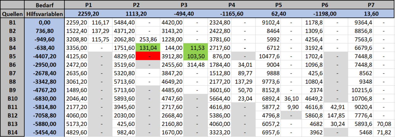
Most solo operators I know run their product roadmap in a spreadsheet. Google Sheets, Airtable if they’re feeling fancy, sometimes just a Notion table. It makes sense at first—quick to set up, easy to sort by priority or launch date, and you already know how to use it.
But spreadsheets fail at the one thing roadmaps need most: showing you what depends on what.
When you shift a launch date or reprioritize a feature, a spreadsheet won’t tell you what else breaks. It won’t show you that the email automation you planned for August requires the API integration you just pushed to October. It won’t flag that your affiliate dashboard redesign depends on Stripe webhook changes you haven’t scoped yet.
You find out when you sit down to build—and by then, you’ve already committed the time.
Dependencies are invisible in rows and columns
Spreadsheets organize information in one dimension: down. You can add columns for status, owner, priority, quarter. You can color-code cells. But you can’t see relationships between tasks without either memorizing them or writing them into a notes column that no one reads.
I learned this the hard way in March when I delayed a course platform integration by three weeks. I’d moved it in my roadmap spreadsheet, updated the target date, marked it yellow for “delayed.” What I didn’t notice until week two: the automated email sequence I’d already drafted referenced features from that integration. The landing page copy assumed it was live. The affiliate program I’d just onboarded partners for was built around it.
None of that was visible in the spreadsheet. I had to manually scan every other row, check my notes, and reverse-engineer what I’d already forgotten.
Visual roadmap tools surface what shifts when you move one piece
Tools like Roadmunk, Craft.io, and ProductPlan aren’t just prettier spreadsheets. They let you draw dependency arrows: this feature blocks that one, this launch requires these three tasks to close first, this campaign can’t start until that integration is live.
When you drag a card to a new date, the tool shows you—immediately—what else needs to move. Some tools auto-shift dependent tasks. Others flag conflicts and make you decide. Either way, you’re not flying blind.
I switched to Roadmunk in April. It’s $19/month for solo use, $49 if you want stakeholder sharing (I don’t). The first week felt like overkill—dragging cards, drawing arrows, setting up swimlanes for different product areas. But the second time I moved a feature, the tool lit up four other tasks that depended on it. Two I’d forgotten entirely.
That paid for six months of subscription in one decision.
When a spreadsheet still works
If you’re managing fewer than ten active initiatives and nothing depends on anything else—pure parallel work—a spreadsheet is fine. If your “roadmap” is really just a prioritized backlog with no sequencing, keep the sheet.
But the moment you have a chain—A before B, B unlocks C—you need a tool that can show you the chain. Otherwise you’re rebuilding the mental model every time you look at the list, and you will miss something.
Migration takes an afternoon, not a week
Most roadmap tools import from CSV. Export your spreadsheet, match the columns (title, description, status, date), and you’re 80% there. The remaining 20% is drawing the dependency lines—which forces you to actually think through what depends on what.
That’s not busywork. That’s the clarity you’ve been missing.
I spent three hours migrating 22 initiatives from Sheets to Roadmunk. By hour two, I’d found three circular dependencies I didn’t know existed—tasks that each assumed the other would ship first. In a spreadsheet, they just sat there, both marked “Q3,” both impossible.
If you’re still roadmapping in a spreadsheet, export it this week and try a visual tool for 30 days. Roadmunk, Craft, ProductPlan, even Trello with a Butler automation to enforce dependencies—anything that shows you the graph, not just the list. You’ll catch one missed dependency in the first week, and that’s worth the entire year of subscription.
What you can’t see, you can’t plan around. And a spreadsheet only shows you rows.