Category: Social Media

  • Canva automation limits: how many scheduled posts you can queue

    Canva automation limits: how many scheduled posts you can queue

    Canva automation limits: how many scheduled posts you can queue

    Canva’s content planner feels unlimited when you start using it. Drag templates into a calendar, schedule posts across Instagram, Facebook, LinkedIn, and TikTok, and let the tool handle publishing. But after you queue 30, 50, or 100 posts, the interface starts behaving differently—and the documentation doesn’t tell you why.

    The limits exist. They’re soft caps tied to account type, platform mix, and post density. If you’re running a content-driven business that batches social creative a month in advance, you’ll hit them. Here’s how the system actually works.

    Queue depth varies by account tier

    Canva Free accounts can schedule roughly 8 posts at a time across all connected platforms. Canva Pro raises that to around 25–30 posts. Canva for Teams allows 100+ scheduled items, but the exact number fluctuates based on platform mix and whether posts include video.

    The caps aren’t documented in a help article with exact numbers. Support reps cite “fair use” and “platform stability,” which translates to: Canva doesn’t want free or low-tier users automating at scale. If you’re scheduling 60 Instagram posts and 40 LinkedIn updates in one sitting, expect the interface to block new additions after you cross the threshold.

    The error message is vague: “You’ve reached your scheduling limit. Try publishing some posts first.” No countdown. No tooltip. Just a soft block.

    Platform-specific limits layer on top

    Even within your account’s total queue cap, individual platforms enforce their own rules. Instagram allows 25 scheduled posts per connected profile. LinkedIn caps at 15. TikTok sits around 10. Facebook and Twitter (X) are more forgiving—closer to 50 each—but those numbers compress if you’re scheduling carousel posts, Reels, or video content.

    Video posts consume more of your queue budget than static images. A single TikTok video might count as two or three “slots” against your cap, especially if it’s longer than 60 seconds. Canva’s scheduler treats video processing as a heavier lift, so it rations how many you can queue simultaneously.

    If you’re using Publer or Buffer alongside Canva, you won’t hit these issues—those tools treat scheduling as a core feature and build infrastructure around high-volume queues. Canva treats scheduling as a convenience layer on top of design, so the architecture isn’t optimized for bulk automation.

    Workarounds when you hit the cap

    First: batch-publish older posts to free up slots. Go into your content calendar, find anything scheduled more than two weeks out, and either publish it immediately (if the timing isn’t critical) or delete it and re-add it later. The system only counts posts in the “scheduled” state, not drafts or published items.

    Second: stagger your scheduling sessions. Instead of queuing 60 posts on the first of the month, schedule 20 on the 1st, 20 on the 8th, and 20 on the 15th. The rolling queue window resets as posts publish, so spreading your scheduling across multiple sessions keeps you under the cap.

    Third: use Canva for design, then export and schedule elsewhere. Download your finished graphics as PNGs or MP4s, then upload them to a dedicated scheduler like Publer, Hootsuite, or Later. You lose the convenience of one-click scheduling, but you gain unlimited queue depth and better analytics.

    When to move off Canva’s scheduler entirely

    If you’re publishing more than 25 posts per week across multiple platforms, Canva’s planner becomes a bottleneck. The caps force you into manual queue management, and the lack of bulk-editing tools (you can’t shift 20 posts forward by three days in one action) makes calendar adjustments tedious.

    For operators running content-heavy brands—daily Instagram carousels, twice-daily LinkedIn commentary, scheduled Twitter threads—Canva works better as a design tool feeding into a real scheduling platform. Design in Canva, export to Publer or Buffer, and let the scheduler handle timing, recycling, and analytics rollup.

    Canva’s limits aren’t a deal-breaker if you’re posting 10–15 times per week. But if your workflow depends on batching a month of content in one session, the caps will force you to either upgrade to Teams (at $120/year for up to five users) or split your stack.

    Got a question about your own scheduling workflow? Reply to this email—I read every response and pull the best questions into future Q&A posts.

    Heads up — some links in this article are affiliate links. If you sign up through them, we may earn a small commission at no extra cost to you. We only recommend tools we use ourselves.


  • Social media APIs throttle embeds differently than timeline requests

    Social media APIs throttle embeds differently than timeline requests

    Social media APIs throttle embeds differently than timeline requests
    Photo by Adem AY on Unsplash

    If you’ve ever built a site that pulls in social media content—testimonials from Twitter, Instagram feed widgets, YouTube video metadata—you’ve probably hit a rate limit at some point. What’s less obvious is that most platforms separate their rate limits by endpoint type, and embeds get treated very differently than timeline or profile requests.

    This matters because the failure modes aren’t the same. A timeline request that hits a rate limit usually returns a 429 status and a retry-after header. An embed request might return a cached fallback, a blank card, or—on some platforms—no error at all, just stale data.

    How platforms split rate limits

    Twitter’s API (now X) has separate buckets for /statuses/show (single tweet lookup, used by oEmbed), /statuses/user_timeline, and /search/tweets. If you’re on the free tier in 2026, you get 500 tweet lookups per month and 1,500 timeline requests. Embed a popular tweet on your homepage that gets 10,000 visits a day? You’ll burn through your embed quota in under an hour, but your timeline widget might still work fine.

    Instagram’s API treats embeds through the oEmbed endpoint separately from the Graph API used for pulling your own feed. The oEmbed endpoint is more permissive—no auth required—but it’s also cached aggressively on Instagram’s side. If you’re embedding a post that’s been deleted or made private, you might still see it rendered for hours because Instagram’s CDN hasn’t invalidated the embed yet.

    YouTube separates video metadata requests (used by oEmbed and the Data API) from channel or playlist requests. The Data API has a quota system measured in units, and a single video details request costs 1 unit, while a search costs 100. Embedding a video costs almost nothing; searching for videos to embed costs a lot.

    When embeds fail silently

    The worst case isn’t a 429 error—it’s when the embed keeps working but shows outdated content. Facebook’s oEmbed endpoint caches post data for up to 24 hours. If someone updates a post you’ve embedded, your site won’t reflect it until Facebook’s cache expires. There’s no manual purge option for third-party embeds.

    Twitter’s embed.js script fetches the rendered HTML client-side after page load. If the tweet’s been deleted, you’ll see a blank space or a “this tweet is unavailable” message—but only after the JavaScript loads and tries to hydrate the embed. Server-side rendering won’t catch this; your HTML will still contain the embed markup, and it’ll look fine until the browser tries to fetch the actual content.

    LinkedIn doesn’t offer a public oEmbed API at all anymore. If you’re embedding LinkedIn posts, you’re either using an unofficial scraper (which will break when LinkedIn changes their HTML structure) or you’re embedding a static screenshot. Neither approach respects rate limits because there’s no API to rate-limit in the first place.

    How to design around this

    If you’re embedding social content dynamically—testimonials, recent posts, social proof—build in a fallback that doesn’t depend on the API being available. Cache the embed HTML server-side with a TTL that matches the platform’s cache duration (24 hours for Facebook, 7 days for Twitter). Serve the cached version by default, and refresh it in the background on a slower schedule than your page views.

    For high-traffic pages, pre-render embeds at build time instead of fetching them on every request. If you’re using a static site generator, fetch the oEmbed data during the build step and store the HTML in your repo. You’ll avoid rate limits entirely, though you’ll need to rebuild when you want fresh content.

    If you’re embedding third-party content—user-generated tweets, Instagram posts from customers—don’t rely on real-time embeds. Fetch the content once when the user submits it, store the rendered HTML or a screenshot, and display that. If the original post gets deleted or rate-limited later, your page still works.

    Monitoring rate limit usage

    Most platforms include rate limit headers in their API responses: X-RateLimit-Limit, X-RateLimit-Remaining, and X-RateLimit-Reset. Log these when you make requests, especially for embeds that fire frequently. You’ll see when you’re close to a limit before you hit it.

    Twitter’s API dashboard shows rate limit usage per endpoint, but only if you’re using OAuth. Anonymous oEmbed requests—common for public embeds—don’t show up in your dashboard. You’ll only know you’ve hit the limit when embeds stop loading.

    YouTube’s quota usage appears in the Google Cloud Console under “APIs & Services.” If you’re embedding videos on multiple sites, they all share the same project quota unless you’ve set up separate API keys. One site hitting the limit will throttle all your other sites until the quota resets at midnight Pacific time.

    If you’re running a content site that embeds social posts frequently, set up alerting when your rate limit remaining drops below 20%. That gives you time to switch to cached embeds or disable dynamic loading before your pages start breaking.

    What are you embedding, and how often does it break? Reply and let us know what rate limits you’ve hit—or if you’ve found a workaround that works better than caching.

  • Reddit’s API pricing killed third-party tools—but RSS still works

    Reddit’s API pricing killed third-party tools—but RSS still works

    Reddit's API pricing killed third-party tools—but RSS still works
    Photo by Brett Jordan on Unsplash

    Reddit’s 2023 API pricing changes forced Apollo, RIF, and a dozen other third-party clients to shut down. The fallout hit solo operators hardest: social listening dashboards, content aggregation tools, and automated posting workflows all broke overnight unless you could justify enterprise-tier API costs.

    Most operators can’t. Reddit’s Developer Platform pricing starts at $0.24 per 1,000 API calls after a 100-call daily free tier. If you’re monitoring a dozen subreddits for content ideas or tracking brand mentions across 50 threads per day, you’ll hit the cap in under a week. Scale to automation or multi-account management, and you’re looking at $12,000+ annually.

    But Reddit’s RSS feeds—an older, quieter feature—still work. They’re unmetered, require no authentication, and return clean XML you can parse with any feed reader or workflow tool. They won’t replace a full API integration, but for content monitoring, trend research, and lightweight automation, RSS covers 80% of what solo operators actually need.

    How Reddit RSS feeds work

    Every subreddit, user profile, and search query has an RSS endpoint. Append .rss to almost any Reddit URL:

    • reddit.com/r/SaaS/.rss — all posts in r/SaaS
    • reddit.com/r/SaaS/new/.rss — sorted by new
    • reddit.com/r/SaaS/search.rss?q=pricing&restrict_sr=1 — search results within a subreddit
    • reddit.com/user/username/.rss — a user’s public post history

    Feeds return the 25 most recent items. No pagination, no historical backfill. Reddit updates feeds every few minutes, but there’s no guaranteed refresh interval. For monitoring breaking discussions, expect a 5–15 minute lag.

    You don’t need an API key. You don’t need OAuth. You don’t need a developer account. Just fetch the URL and parse the XML.

    What you can (and can’t) do with RSS

    RSS works for:

    • Monitoring subreddits for content ideas or competitor mentions
    • Aggregating niche community discussions into a single feed reader
    • Triggering Zapier or Make workflows when keywords appear in post titles
    • Pulling top posts into a weekly digest or Slack channel

    RSS doesn’t give you:

    • Comment threads (only top-level post data)
    • Vote counts, upvote velocity, or ranking signals
    • The ability to post, reply, or interact programmatically
    • More than 25 items per feed

    If you need to analyze engagement metrics, scrape comment sentiment, or automate posting, you’re back to the paid API or manual workflows. But if your goal is awareness—knowing what’s being discussed, when, and by whom—RSS handles it.

    The reliability question

    Reddit hasn’t officially deprecated RSS, but they haven’t promoted it in years. The feature predates the 2023 API lockdown and wasn’t part of the pricing announcement. That makes it both useful and precarious.

    There’s no SLA. No public roadmap. No guarantee Reddit won’t shut it down next quarter to push more traffic through the official app and API tiers. Operators who built RSS-dependent workflows in 2024 are watching for signs: feed downtime, format changes, or silent rate-limiting.

    So far, the feeds are stable. Anecdotally, I’ve seen zero throttling on personal projects polling 40+ subreddit feeds every 15 minutes via Feedly and Zapier. That doesn’t mean Reddit won’t change course, but it does mean the feature isn’t being aggressively sunsetted yet.

    If you’re considering an RSS-based Reddit workflow, build with an exit plan. Use a feed reader or automation tool that lets you swap sources quickly. Don’t hard-code Reddit URLs into customer-facing products. Treat RSS as a time-limited workaround, not infrastructure.

    Practical setup

    The simplest approach: drop Reddit RSS URLs into Feedly, Inoreader, or any standard feed reader. Tag by topic, filter by keyword, and review daily.

    For automation, connect RSS to Zapier, Make, or n8n. Trigger actions when a post title matches a keyword or when a subreddit publishes anything new. Example: new post in r/SaaS containing “launch” → send to Slack → log in Notion.

    If you’re comfortable with code, fetch the .rss endpoint with a standard HTTP client, parse the XML, and filter in your own pipeline. No auth headers, no token refresh, no SDK to maintain.

    Reddit’s RSS feeds aren’t a substitute for real API access, but they’re a functional stopgap while the platform’s developer ecosystem remains priced out of reach for most solo operators. Use them while they last.

    Running a content-driven business? One Two Three Send covers tools, workflows, and operator tactics every week. Subscribe here.

  • Instagram alt-text editing: how it works after you publish

    Instagram alt-text editing: how it works after you publish

    Instagram alt-text editing: how it works after you publish
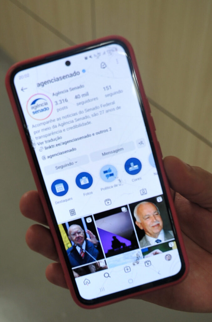
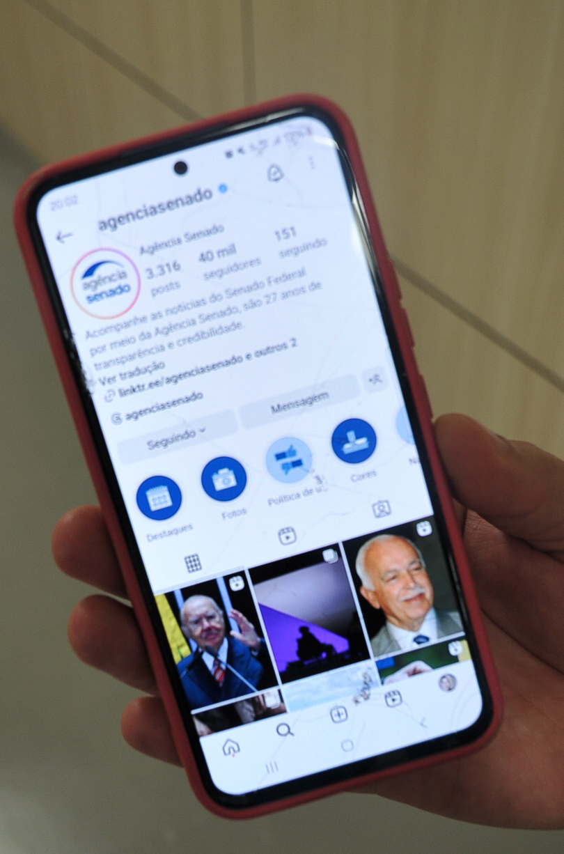
    Photo: Agência Senado from Brasilia, Brazil via Wikimedia Commons (CC BY 2.0)

    Instagram lets you add alt text to every post, Reel, and Story image. Most operators either skip it entirely or fill it in once during upload and forget it exists. What fewer people realize: you can edit alt text after publication—and there are real reasons to do it.

    If you’re running a content-driven business on Instagram, alt text isn’t just an accessibility feature. It’s indexable metadata that can surface your posts in search, and it’s a second chance to clarify context when a caption doesn’t tell the full story.

    How to edit alt text after you’ve published

    Open the post. Tap the three-dot menu in the top right. Select Edit. At the bottom of the screen (below the caption field), you’ll see Advanced Settings. Tap it. Scroll down to Alt Text. Tap Write Alt Text, edit the field, and save.

    The interface hasn’t changed much since Instagram added manual alt text in 2018, but it’s still buried two taps deeper than caption editing. That’s deliberate—Instagram auto-generates alt text using object recognition, and most users never touch it.

    For operators, though, the auto-generated version is almost always too generic. A product photo might get tagged as “image may contain: indoor, table, object” when what you actually posted was a course workbook mockup on a desk. The difference matters for search discoverability and for screen-reader users.

    When to go back and edit alt text

    Three scenarios where editing after publication makes sense:

    You published in a rush and skipped it. Common when you’re posting from mobile during a launch or event. Circle back within 24 hours—Instagram’s ranking window for Explore and hashtag feeds is short, but search indexing is ongoing.

    The post is evergreen and still getting impressions weeks later. If a carousel or single image keeps showing up in your top posts by reach, adding better alt text can extend its shelf life in search. Check your Instagram Insights for posts with long tails—anything still pulling 100+ impressions per week after 30 days is worth revisiting.

    You’re repurposing content across platforms and want consistent metadata. If you cross-post to Facebook (which shares alt text fields), Pinterest, or LinkedIn, editing Instagram’s alt text keeps your asset library uniform. Especially useful if you’re using a scheduler like Publer that can carry alt text forward into future posts.

    One non-obvious gotcha

    Instagram doesn’t timestamp alt text edits, and it doesn’t notify followers when you change it. That sounds convenient—no “edited” label like you get on captions—but it creates a tracking problem.

    If you’re running tests (say, comparing generic vs. descriptive alt text on product posts), you can’t tell from the Instagram app when you made the change. The edit is invisible in your activity log. If you’re A/B testing alt text impact on reach, you need to log the change externally—spreadsheet, notes app, or a dedicated social media tracker.

    This also means you can’t reverse-engineer what alt text a competitor used if they’ve edited it. You only see the current version. If you’re researching how other operators optimize for Instagram search, screenshot the alt text the first time you see a post, because it might not be there next week.

    What to write (and what to skip)

    Alt text should describe what’s in the image, not repeat your caption. Instagram’s guidance says 100 characters or fewer, but the field accepts up to 300. Screen readers handle long alt text fine, but search indexing seems to weight the first 100–125 characters more heavily based on anecdotal testing from accessibility-focused operators.

    Skip hashtags, emojis, and brand slogans. Don’t write “Photo of…” or “Image shows…”—screen readers already announce it’s an image. Just describe it: “Laptop on desk with coffee mug and open notebook” beats “Image may contain: electronics, beverage, indoor.”

    If the image contains text (quote graphic, announcement, tutorial screenshot), transcribe the key text in the alt field. Instagram’s auto-recognition doesn’t do OCR reliably, so “Launch day: 300 subscribers in 48 hours” is better alt text than “text, screenshot.”

    For carousels, you write separate alt text for each image. Tap into edit mode, swipe to the image you want to describe, open Advanced Settings, and write the alt text for that slide. It’s tedious for 10-slide carousels, but if you’re repurposing a carousel as a lead magnet or using it in ads later, front-loading that work pays off.

    Does it actually affect reach?

    Instagram has never confirmed that alt text is a ranking signal for Explore or hashtag feeds. But it’s confirmed that alt text feeds into search—both the general search bar and the newer keyword search that rolled out in 2024. If someone searches “newsletter dashboard screenshot” and your alt text says exactly that, you have a better shot at surfacing than if Instagram auto-tagged it as “screenshot, text, computer.”

    Anecdotally, operators who’ve back-filled alt text on 50+ evergreen posts report small upticks in profile visits from search—5–10% over 60 days. Not explosive, but enough to make it worth 15 minutes of cleanup work.

    More importantly, it’s a file-keeping habit that saves time later. If you ever export your Instagram content (for a portfolio, a website gallery, or a course), having real alt text instead of auto-generated garbage makes the migration cleaner.

    Want this in your inbox? One Two Three Send breaks down one tool, tactic, or workflow decision every day—no fluff, just what works for operators running online businesses. Subscribe at the top of the page.

    Heads up — some links in this article are affiliate links. If you sign up through them, we may earn a small commission at no extra cost to you. We only recommend tools we use ourselves.
  • Buffer vs. Publer vs. Hootsuite: which scheduler fits your workflow

    Buffer vs. Publer vs. Hootsuite: which scheduler fits your workflow

    Buffer vs. Publer vs. Hootsuite: which scheduler fits your workflow
    Photo: Raysonho @ Open Grid Scheduler / Scalable Grid Engine via Wikimedia Commons (CC0)

    Social media schedulers all promise the same outcome—posts go out on time across multiple platforms—but the workflow, pricing, and feature ceiling vary enough that the wrong choice costs you hours every month.

    Here’s how Buffer, Publer, and Hootsuite compare for solo operators and small teams running content-driven businesses, with real pricing and the non-marketing-page details that matter when you’re scheduling 40+ posts a week.

    Pricing structure and profile limits

    Buffer’s free tier allows three social profiles and ten scheduled posts per profile. The Essentials plan starts at $6/month per profile. If you manage a newsletter brand across Twitter, LinkedIn, Facebook, and Instagram, that’s $24/month before you add a second team member.

    Publer offers a free tier with one brand (unlimited profiles within that brand) and ten posts per profile. The Professional plan runs $12/month for five brands, 500 posts per brand, and bulk scheduling. For most solo operators with one core brand and multiple platforms, this is the better math.

    Hootsuite’s free tier disappeared in late 2025. The Professional plan starts at $99/month for one user and ten profiles. It’s built for agencies and mid-size marketing teams, not solo operators. Unless you need advanced analytics integrations or client approval workflows, the price floor doesn’t match the operator profile reading this newsletter.

    Bulk upload and content recycling

    Buffer’s bulk scheduling works via CSV upload, but the free and Essentials tiers don’t support it—you need the Team plan at $12/month per profile. The CSV format is strict: one row per post, with separate columns for each network. If you cross-post the same content to three platforms, you duplicate rows.

    Publer’s bulk uploader accepts CSV and allows content recycling within the Professional plan. You can set a post to repeat every 30 days or queue evergreen content to rotate automatically. The interface supports drag-and-drop rearrangement after upload, which saves time when you need to reorder a week’s worth of posts.

    Hootsuite’s bulk scheduler is robust but overkill for most solo setups. It supports CSV and RSS feed ingestion, with conditional logic for different networks. You pay for power you likely won’t use unless you’re managing ten+ brands with unique posting cadences per platform.

    Platform-specific quirks

    All three handle the major platforms—Twitter, LinkedIn, Facebook, Instagram, Pinterest—but implementation details differ.

    Buffer auto-threads Twitter posts if you exceed 280 characters. Publer requires manual thread setup but shows a live preview of how the thread will render. Hootsuite supports threads but buries the feature in a submenu most users miss.

    For LinkedIn carousels, Publer is the only one of the three that natively supports PDF upload and conversion without requiring a workaround. Buffer and Hootsuite treat carousels as image sets, which means you’re exporting slides individually and uploading them in sequence.

    Instagram first-comment scheduling—where you want a link or CTA to post as the first comment under your image—is supported in Publer’s Professional tier and Hootsuite’s all plans. Buffer added it in mid-2025, but only on Team tier and above.

    Who each tool fits

    Pick Buffer if you manage three or fewer profiles, post fewer than ten times per week per platform, and don’t need bulk uploading. The per-profile pricing scales badly, but the interface is clean and the mobile app is reliable.

    Pick Publer if you run one brand across four to six platforms, post daily, and want bulk scheduling and content recycling without jumping to a $99/month tool. The Professional plan at $12/month covers most solo and two-person team use cases.

    Pick Hootsuite if you’re managing multiple clients, need approval workflows, or require integration with enterprise analytics platforms like Sprout Social or Salesforce. For a single online business, it’s overbuilt and overpriced.

    One non-obvious consideration: check each platform’s API rate limits during high-traffic periods. Hootsuite and Buffer have priority API access with most networks due to partnership agreements. Publer, as a smaller player, occasionally hits Instagram’s rate limit if you schedule more than 25 posts in a single batch. It’s rare, but it happens.

    What’s working for you? Reply with the scheduler you’re using and whether the pricing model still makes sense as your posting volume grows. We’ll compile operator feedback in a future piece.

    Heads up — some links in this article are affiliate links. If you sign up through them, we may earn a small commission at no extra cost to you. We only recommend tools we use ourselves.
  • Social media scheduling tools charge per profile—here’s the math

    Social media scheduling tools charge per profile—here’s the math

    Social media scheduling tools charge per profile—here's the math
    Photo by Shutter Speed on Unsplash

    Social media scheduling tools advertise their pricing per user or per month, but the real cost driver is hidden one line down: connected social profiles. Connect three Twitter accounts, two Instagram profiles, and a LinkedIn page, and you’ve just burned through six profile slots—often before you’ve scheduled a single post.

    Most solo operators discover this the hard way when they hit a tier ceiling or get an upgrade prompt halfway through onboarding. Here’s how the billing actually works, what counts as a profile, and when it makes financial sense to consolidate or split your setup.

    How profile-based pricing works

    A “profile” is any individual social media account you authorize the scheduling tool to post to. That means:

    • Each Twitter/X account = 1 profile
    • Each Instagram account = 1 profile (even if it’s a business account linked to the same Facebook page)
    • Each Facebook page = 1 profile
    • Each LinkedIn personal profile = 1 profile
    • Each LinkedIn company page = 1 profile
    • Each Pinterest board set = 1 profile
    • Each TikTok account = 1 profile

    Most tools in the $15–$30/month tier cap you at 5–10 profiles. Publer‘s base plan allows 5 profiles for $12/month; Buffer’s Essentials tier gives you 3 channels for $6/month per channel; Hootsuite starts at 10 profiles for $99/month. If you run a personal brand, a side project, and a client account, you’re already at 9–12 profiles depending on how many networks each presence spans.

    The pricing jumps aren’t linear. Going from 10 to 15 profiles often doubles your monthly cost, and tools don’t prorate—if you need 11 profiles, you pay for the 15- or 20-profile tier.

    What actually counts as separate profiles

    Instagram business accounts linked to Facebook pages still count as two separate profiles in most tools, even though Meta treats them as a paired entity. If you manage both the Instagram account and its parent Facebook page, that’s two slots.

    LinkedIn personal profiles and company pages are always separate, even if you’re the sole admin of the company page. Scheduling to both burns two profiles.

    Twitter/X accounts are straightforward: one account = one profile. But if you run a brand account and a founder account, that’s two.

    Some tools treat Pinterest differently. A few count your entire Pinterest presence as one profile; others count each board you schedule to separately. Check the tool’s FAQ before connecting Pinterest—it’s the billing wild card.

    Threads accounts, as of mid-2026, are starting to appear as standalone profiles in newer tools. If your tool added Threads support recently, expect it to count separately from Instagram, even though they share a login.

    When to consolidate vs. pay for more profiles

    If you’re managing a personal brand and one side project across four networks (Twitter, LinkedIn, Instagram, Facebook), you’re at 8 profiles. Consolidating down to three networks drops you to 6 profiles, which might slide you into a cheaper tier and save $10–$20/month.

    The calculus changes if those extra profiles generate revenue. A client account that pays $500/month justifies the $15 tier bump. A side project Instagram with 800 followers and no monetisation path doesn’t.

    Splitting tools is sometimes cheaper than upgrading. If you need 12 profiles, paying for two separate tools at the 5-profile tier ($12/month each = $24 total) often beats a single tool’s 15-profile tier at $39/month. The tradeoff: you lose unified analytics and have to check two dashboards.

    One non-obvious trick: if you only post to certain profiles sporadically, disconnect them between campaign bursts. Most tools let you reconnect profiles without losing historical post data. A quarterly LinkedIn company page update doesn’t need to occupy a profile slot year-round.

    Profile limits and team growth

    Profile caps bite hardest when you add a team member who brings their own accounts. A VA with their own Instagram and Twitter presence can add 2–4 profiles to your tool overnight, pushing you into the next tier even if they’re only scheduling for you 10 hours a week.

    Some tools separate user seats from profile counts; others bundle them. Buffer charges per channel but allows unlimited users per account. Publer charges per profile and allows 1–10 users depending on tier. Hootsuite charges for both users and profiles, but scales the profile limit with user count.

    If you’re hiring contractors who manage their own social accounts, ask whether they can bring their own scheduling tool login instead of adding their profiles to yours. You lose some workflow visibility, but you avoid the tier jump.

    Profile-based pricing isn’t going away—it’s the revenue model that funds these tools’ API costs and storage. But understanding the math before you connect a seventh account saves you from surprise billing and forces a useful question: which profiles actually matter?

    What’s your profile count across tools right now? Hit reply and let me know if you’ve found a billing structure that actually works for multi-project operators.

    Heads up — some links in this article are affiliate links. If you sign up through them, we may earn a small commission at no extra cost to you. We only recommend tools we use ourselves.
  • Canva’s Brand Kit tier limits: when color palettes hit the wall

    Canva’s Brand Kit tier limits: when color palettes hit the wall

    Canva's Brand Kit tier limits: when color palettes hit the wall
    Photo: Vijay Verma via Wikimedia Commons (CC0)

    Canva’s Brand Kit feature centralizes your visual identity—logos, fonts, color palettes—so every graphic you create stays on-brand. It’s one of the platform’s most useful features for solo operators who don’t want to manually copy hex codes or hunt for the right logo file every time they make a social post.

    But the Brand Kit isn’t one-size-fits-all. Canva gates the feature across three tiers—Free, Pro, and Teams—and each tier imposes hard limits on how many palettes, fonts, and logos you can store. Hit those limits mid-project, and you’re stuck either deleting old assets or upgrading.

    Here’s what each tier actually allows, when you’ll hit the ceiling, and how to work around it without paying more than you need to.

    What each tier lets you store

    Canva Free: One brand kit total. Inside that kit, you get one color palette (up to three colors), one font pairing, and one logo upload. That’s it. If you run multiple projects—say, a newsletter and a podcast with different visual identities—you can’t store both. You’ll need to manually swap assets every time you switch contexts.

    Canva Pro: Unlimited brand kits. Each kit supports up to 100 color palettes, 100 font pairings, and 100 logos. For most solo operators, this is more than enough. The real constraint here isn’t the cap—it’s organization. Once you’ve got 30+ palettes saved, finding the right one becomes a search problem.

    Canva for Teams: Same storage limits as Pro (100 per asset type per kit), but designed for shared access. Multiple users can edit and apply the same Brand Kit. Pricing starts at $100/year for up to five people, so it’s overkill unless you’re actually collaborating with a team or VA.

    When you’ll hit the limit

    If you’re on Free, you’ll hit the wall immediately if you manage more than one brand. The single-kit limit forces you to choose: either keep everything under one visual identity, or manually re-upload assets every time you switch projects.

    On Pro, the 100-palette cap sounds generous, but it sneaks up on you if you create seasonal campaigns, A/B test color schemes, or work with clients. Each palette can only hold three colors, so if you’re building out a full brand system with primary, secondary, and accent palettes, you’re using multiple slots per brand. Operators who run paid template libraries or design-heavy newsletters can burn through 30–40 palettes in a year.

    The font pairing limit (also 100) is rarely a problem. Most operators settle on two to three pairings and stick with them. Logos, same deal—unless you’re managing client work or sub-brands, you won’t approach the cap.

    Workarounds that don’t require an upgrade

    Archive unused palettes quarterly. Canva doesn’t let you export a Brand Kit as a backup file, but you can screenshot your palettes or copy hex codes into a note. Delete seasonal or one-off palettes after campaigns end, and restore them manually if you need them again later. It’s tedious, but free.

    Consolidate palettes using external color management. Instead of saving every variation in Canva, store your full color system in a tool like Coolors or a simple spreadsheet. Keep only your two to three most-used palettes in Canva’s Brand Kit, and copy-paste hex codes for edge cases. This keeps your Brand Kit lean and searchable.

    Use templates as palette storage. Create a blank Canva design, fill it with color swatches, and save it as a reusable template. You can duplicate the template anytime and eyedropper the colors into new designs. It’s a hack, but it bypasses the Brand Kit limit entirely.

    When upgrading actually makes sense

    If you’re solo and on Free, the $120/year Pro upgrade is worth it the moment you manage two distinct brands. The jump from one kit to unlimited eliminates the constant asset-swapping friction.

    If you’re already on Pro and hitting the 100-palette limit, pause before upgrading to Teams. The extra cost ($100/year vs. $120/year for Pro) doesn’t increase storage—it only adds collaboration features. Instead, audit your saved palettes. Most operators find that 60–70% of their stored palettes are outdated or redundant. Delete those, and you’ll buy yourself another year before the cap matters again.

    Teams makes sense only if you’re actually sharing brand access with collaborators—a VA formatting posts, a designer building templates, or a co-founder who needs the same visual assets. If it’s just you, Pro is the ceiling.

    One non-obvious tip: Canva’s Brand Kit color picker auto-suggests palettes based on uploaded logos. If you upload a logo with your full color system embedded, Canva will extract a palette for you. Use this to quickly populate a new Brand Kit without manually entering hex codes—but double-check the extracted colors against your source file, because Canva’s algorithm sometimes picks slightly off-brand shades.

    Managing multiple brands or seasonal campaigns? Reply and tell us how you organize your color systems—we’ll feature operator setups in a future issue.

  • LinkedIn carousels export at 1080×1080—here’s the workaround

    LinkedIn carousels export at 1080×1080—here’s the workaround

    LinkedIn carousels export at 1080×1080—here's the workaround
    Photo by Mariia Shalabaieva on Unsplash

    LinkedIn’s carousel post format—technically called document posts—lets you upload PDFs that readers swipe through like Instagram carousels. It’s a solid format for reaching professional audiences without leaving the platform.

    But there’s a design constraint nobody mentions until after you’ve built your first deck: LinkedIn exports every carousel slide as a 1080×1080 pixel square, regardless of what you uploaded. If you designed slides in 16:9 widescreen or portrait 9:16, the platform letterboxes them with white bars or crops them unpredictably.

    This matters because most design tools—Canva, Figma, Keynote—default to landscape aspect ratios for presentation decks. You can spend an hour building a carousel in 1920×1080, upload it to LinkedIn, and watch it get squashed into a square with your text pushed to the edges or cut off entirely.

    Why LinkedIn forces square slides

    LinkedIn’s document post feature converts uploaded PDFs into image carousels optimised for mobile feeds. The platform standardises everything to 1080×1080 because square posts take up more vertical real estate in the feed and perform better on mobile screens.

    The conversion happens server-side. You upload a PDF, LinkedIn rasterises each page, and crops or pads to square. There’s no setting to change this. The upload interface accepts PDFs up to 100 MB and 300 pages, but the output format is non-negotiable.

    Design in square from the start

    The simplest fix: build your carousel slides at 1080×1080 pixels before you write a single word.

    In Canva, create a custom design and set dimensions to 1080×1080 px (or use the Instagram Post preset, which defaults to square). In Figma, create a 1080×1080 frame. In Keynote or PowerPoint, set slide size to custom dimensions: 1080 width, 1080 height, with units in pixels.

    This forces you to think vertically. Text blocks need tighter line lengths. Charts and graphs need larger fonts. Horizontally-oriented infographics won’t fit—you’ll need to stack elements instead of spreading them left-to-right.

    Square slides also change how you use whitespace. In widescreen decks, you can balance a headline on the left with a visual on the right. In square format, that same layout feels cramped. Center-aligned, single-focus slides work better.

    If you’ve already built slides in widescreen

    You have three options, none of them fast.

    Option one: Rebuild from scratch. Copy your text into a new square template and reposition every element. Time-consuming, but you’ll avoid cropping issues.

    Option two: Export widescreen slides as images, then embed them in a square PDF. Create a 1080×1080 canvas in Canva or Figma, place your 1920×1080 slide image in the center, and export each page as a PDF. This preserves your original layout but adds letterboxing (black or white bars above and below). It works if your design can tolerate the padding, but it wastes vertical space.

    Option three: Crop strategically. If your widescreen slides have a clear focal point, you can manually crop each one to 1080×1080 in an image editor, keeping the most important content centered. This only works if your text and visuals are already concentrated in the middle third of the slide.

    Non-obvious tip: Use safe zones

    Even when you design in square, LinkedIn’s mobile app crops the top and bottom of carousel slides slightly when they appear in-feed. Users see the full square only after they tap to expand.

    To avoid cut-off text, keep critical content—headlines, CTAs, key data points—within a centered 1080×920 pixel safe zone. That’s roughly 80 pixels of padding on top and bottom.

    In Canva, add a rectangle guide at 1080×920, center it, and design inside that boundary. In Figma, create a nested frame. This ensures your most important content is visible even before someone taps through.

    One more detail: LinkedIn compresses uploaded PDFs. If you’re using gradients, subtle shadows, or fine typography, export your PDF at high quality (300 DPI if your tool supports it) to minimize artifacting. The platform will still compress it, but starting with a high-resolution source reduces quality loss.

    Hit reply and tell us: what’s one LinkedIn carousel design mistake you made that you won’t repeat? We read every response.

  • Canva’s Magic Resize: when aspect-ratio automation saves time vs. breaks it

    Canva’s Magic Resize: when aspect-ratio automation saves time vs. breaks it

    Canva's Magic Resize: when aspect-ratio automation saves time vs. breaks it
    Photo: Bystronic Corporate Communications via Wikimedia Commons (CC BY-SA 4.0)

    Canva’s Magic Resize feature promises to turn one social graphic into ten platform-ready versions with a single click. You design once at 1080×1080, hit resize, select Instagram Story + LinkedIn post + Pinterest pin, and the tool redistributes text boxes, images, and spacing to fit each canvas.

    It works exactly as advertised—when your design is simple. Two text blocks, a centered logo, and a background gradient? Magic Resize handles it cleanly. But stack five text layers with custom positioning, overlay transparent PNGs, or use grouped elements with manual kerning, and you’ll spend more time fixing the output than you would rebuilding from scratch.

    How Magic Resize decides what moves

    Magic Resize uses a hierarchy system. Canva prioritizes foreground elements (text boxes, stickers, uploaded images) over background layers. When you switch from a 1:1 square to a 9:16 Story canvas, the tool expands the vertical space and redistributes elements top-to-bottom based on their original layering order.

    Text boxes resize proportionally by default—font size stays fixed, but line breaks reflow to fit the new width. Images scale to maintain aspect ratio. Background fills stretch to cover the entire canvas without cropping.

    The problem: Canva doesn’t understand visual hierarchy the way you do. If your Instagram square placed a call-to-action at the bottom because that’s where the eye naturally lands in that format, Magic Resize will keep it at the bottom of a tall Story canvas—where it’s offscreen until someone swipes up.

    Grouped elements break the logic entirely. If you’ve grouped a text box with a shape to create a custom badge, Magic Resize treats the group as a single object and scales it proportionally. A badge that was 15% of your square design becomes 15% of your Story height—often way too large or positioned awkwardly.

    When to use it vs. when to duplicate manually

    Magic Resize works best for templated content where layout consistency matters more than pixel-perfect positioning. Weekly quote graphics, announcement cards, course promotional images—anything with one dominant message and minimal layering.

    Skip it when:

    • Your design uses more than four text layers with custom positioning
    • You’ve applied manual spacing or alignment that depends on the original canvas shape
    • Grouped elements make up more than 30% of the design
    • You’re resizing from a horizontal format (16:9 YouTube thumbnail) to vertical (Pinterest pin)—the text reflow often breaks readability

    For complex designs, duplicate the original file instead. Canva lets you copy an entire design and manually adjust the canvas dimensions. You’ll spend three minutes repositioning elements yourself, but you’ll have full control over what moves and what scales.

    The non-obvious tip: pre-size your text boxes

    Most operators let Canva auto-size text boxes—you type, the box expands to fit, and you drag it into place. That approach breaks Magic Resize because the tool doesn’t know which dimension (width or height) you prioritized.

    Instead, manually set text box dimensions before you type. Click the text box, drag it to a fixed width (say, 800 pixels on a 1080-wide canvas), then type your headline. Lock the width in place. When Magic Resize redistributes the layout, it preserves your width ratio and reflows text vertically—keeping line breaks predictable.

    Same goes for images. If you upload a logo or product shot, resize and position it first, then lock the layer. Magic Resize respects locked elements and works around them, giving you anchor points that stay consistent across formats.

    Pricing and access

    Magic Resize is available on Canva Pro ($15/month for solo users, $30/month for up to five team members) and Canva for Teams plans. The free tier doesn’t include it—you’ll need to manually duplicate and resize instead.

    If you’re publishing to three or more platforms weekly and your designs stay simple (under five layers, minimal grouping), the feature pays for itself in saved time. If your graphics are layout-heavy or require tight control over spacing and alignment, the Pro subscription still has value for the template library and Brand Kit features, but Magic Resize won’t be the reason you renew.

    Want more tool breakdowns like this? Subscribe to One Two Three Send and get operator-focused features, comparisons, and how-tos every week—no fluff, just the details that matter when you’re running a content business solo.

  • Instagram Broadcast Channels: how the one-way DM feature works

    Instagram Broadcast Channels: how the one-way DM feature works

    Instagram Broadcast Channels: how the one-way DM feature works
    Photo: ЗАО «Азия Ритейл» via Wikimedia Commons (CC BY 4.0)

    Instagram Broadcast Channels are a one-to-many messaging feature that lives inside Direct Messages. You send updates, photos, polls, or voice notes to subscribers who’ve opted in—but they can’t reply directly to the group. Only you can broadcast; they can react with emojis or reply privately to you.

    It’s not a feed post, not a Story, and not a newsletter. It’s a notification-driven channel where every message hits your subscribers’ DM inbox with a push alert, assuming they haven’t muted you.

    How it works

    You create a Broadcast Channel from your Instagram profile or DM screen. Give it a name, pick an audience (everyone or paid subscribers only, if you have subscriptions enabled), and start sending. Subscribers join by tapping a link you share in Stories, posts, or your bio.

    Messages you send appear in chronological order. Subscribers see them in their DM list, alongside regular conversations. There’s no algorithmic feed here—what you send is what they see, in order.

    You can send text, photos, videos up to 60 seconds, voice notes, and polls. Links work. You can also share posts from your feed or others’ accounts directly into the channel. Subscribers can react with emoji, and you’ll see a count, but they can’t post their own messages to the group.

    If a subscriber wants to reach you, they send a separate private DM. The channel itself stays one-directional.

    When to use it

    Broadcast Channels make sense when you want direct reach without depending on the feed algorithm, but you’re already building an audience on Instagram. Think of it as an owned notification channel inside a rented platform.

    Operators use them for:

    • Quick updates: Product drops, new post alerts, schedule changes. Faster than Stories, more direct than a feed post.
    • Exclusive previews: Behind-the-scenes content, early access to links, or subscriber-only commentary on news in your niche.
    • Community engagement without moderation overhead: Unlike a group chat, you’re not managing dozens of replies or off-topic threads. Subscribers react, you move on.
    • Driving traffic off-platform: Share a link to your latest article, course launch, or affiliate review. The push notification increases click-through compared to a bio link.

    It’s not a replacement for email. Instagram controls delivery, and subscribers can leave or mute without you knowing immediately. But if your audience lives in DMs and you’re already posting daily, it’s a low-friction way to add a direct line.

    The non-obvious tip: use polls to surface reply-worthy topics

    Broadcast Channels don’t allow group replies, but subscribers can DM you privately. Most won’t—unless you give them a reason.

    Here’s the trick: use polls not just for engagement metrics, but to identify high-interest topics, then explicitly invite private replies on the winner.

    Example: you run a course-creation business. Send a poll: “Next tutorial—email sequence breakdowns or sales page teardowns?” Once results come in, follow up with: “Sales page teardowns won. If you’ve got a page you want reviewed, DM me the link—I’ll pick one for Friday’s breakdown.”

    This does two things. First, it turns a passive poll into a conversation starter. Second, it fills your DM inbox with qualified leads or content ideas without you fishing for them in comments.

    The same tactic works for product feedback, topic requests, or case study volunteers. Polls lower the friction to signal interest; the follow-up prompt converts that interest into a direct message you can act on.

    Limits and gotchas

    Instagram doesn’t publish a hard subscriber cap for Broadcast Channels, but the feature is designed for creators with established audiences—you need a Creator or Business account to start one.

    Messages you send are permanent until you delete them. Subscribers can screenshot anything. Treat it like public content, even though it feels private.

    There’s no built-in analytics dashboard. You’ll see reaction counts and poll results, but Instagram doesn’t show you open rates, click-through on links, or subscriber growth over time. You’re flying partially blind compared to email platforms like Postmark or MailerLite, where delivery and engagement metrics are standard.

    If you’re juggling Instagram Broadcast Channels alongside other social platforms, tools like Publer can centralise your scheduling workflow—though Broadcast Channel messages themselves still need to be sent manually from the Instagram app.

    One more thing: subscribers don’t get a digest. Every message you send triggers a separate notification. Send too often, and they’ll mute or leave. There’s no research-backed frequency ceiling, but operators I’ve talked to stick to 2–4 messages per week unless they’re running a time-sensitive campaign.

    If you’re testing Broadcast Channels or have questions about balancing Instagram and email, reply to this issue—I read every message and often turn good questions into future breakdowns.

    Heads up — some links in this article are affiliate links. If you sign up through them, we may earn a small commission at no extra cost to you. We only recommend tools we use ourselves.