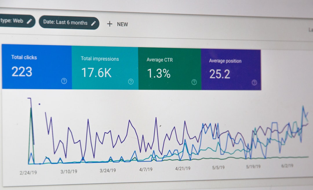
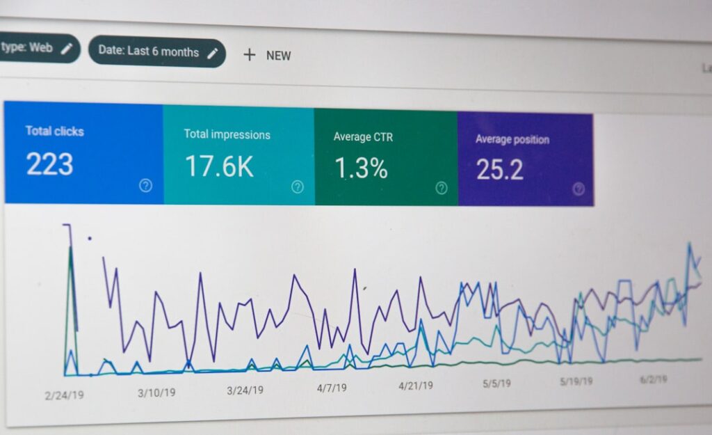
Most analytics platforms ship with attractive templates. You connect your data source, the dashboard populates itself, and you get a grid of charts that look professional enough to screenshot for a board deck.
The problem: those templates measure what the vendor thinks matters, not what actually drives your business. And because they look polished, operators assume they’re looking at the right metrics—until revenue stalls and the dashboard still shows green.
What pre-built dashboards optimise for
Analytics vendors design default templates to serve the widest possible audience. That means they prioritise:
- Vanity metrics that trend upward. Page views, session counts, total subscribers. These make new users feel good and reduce churn during trial periods.
- Metrics that showcase platform features. If the tool sells attribution modelling, the dashboard will surface multi-touch funnels—even if you’re a solo operator with one traffic source.
- Industry averages that may not apply. E-commerce dashboards assume you care about cart abandonment rate. But if you sell a $2,000 course with a multi-week consideration cycle, cart behaviour is noise.
The result: you spend every Monday morning reviewing a dashboard that tells you visits are up 12% but can’t explain why revenue per subscriber dropped.
The metrics that actually matter depend on your model
If you run a sponsored newsletter, your core dashboard should answer:
- What’s my seven-day open rate by acquisition source?
- Which posts drove the most sponsor link clicks?
- What’s my subscriber-to-sponsor-ready ratio? (Sponsors care about engaged readers, not total list size.)
If you sell a productised service with monthly retainers, you need:
- Monthly recurring revenue vs. one-time project income.
- Client lifetime value by acquisition channel.
- Churn rate and leading indicators (missed payments, support ticket volume).
If you monetise with affiliates and ad networks, track:
- Revenue per thousand visitors by content category.
- Affiliate conversion rate by product and placement.
- Traffic source profitability after paid acquisition cost.
None of these maps cleanly onto a Google Analytics 4 or Plausible default template. You have to build it yourself.
When to abandon the template and start from scratch
Here’s the test: open your current dashboard and ask, “If this metric moved 20% in either direction, would I change what I do this week?”
If the answer is no, delete the widget.
Then list the three business questions you asked yourself in the last 30 days. Examples:
- “Why did last week’s post convert worse than the week before?”
- “Which traffic source sends readers who actually buy?”
- “Is my welcome sequence still working, or has open rate decayed?”
Build one dashboard widget per question. If your analytics platform can’t answer it, you’re either tracking the wrong events or using the wrong tool.
What good custom dashboards look like
Effective operator dashboards are not beautiful. They’re a small grid—often just four to six widgets—that update weekly and drive a specific decision.
A working example from a course creator I consulted for:
- Widget 1: Revenue this month vs. same month last year.
- Widget 2: Email-to-purchase conversion rate for the last four launches.
- Widget 3: Refund rate by cohort (tracks product-market fit over time).
- Widget 4: Traffic source breakdown for purchase-page visitors (not all visitors).
That’s it. Four numbers. Every Monday, she knows whether to focus on traffic, conversion, or retention. The default Stripe dashboard showed gross volume and successful charges—impressive numbers that didn’t clarify what to do next.
One dashboard, one decision
If you’re still using a pre-built template, block an hour this week to rebuild from scratch. Start with one business question. Add only the metrics that answer it. If you can’t connect a widget to a decision you’ll make in the next 30 days, leave it out.
The goal isn’t a dashboard that impresses a investor. It’s a dashboard that tells you what to do on Tuesday.
What’s the one metric you check every week that actually changes how you work? Hit reply and tell me—I’m collecting examples for a deeper dive on operator-specific analytics setups.