Unsubscribe links sit in the footer of every newsletter you send. But where in that footer—and how prominently—varies wildly across platforms. That placement isn’t just aesthetic. It changes deliverability, spam complaint rates, and reader behavior in ways most operators never notice until something breaks.
Here’s how the major platforms handle it, what each approach signals to inbox providers, and when you should care enough to override the default.
Footer vs. header: what the platforms do
Most ESPs place the unsubscribe link in the email footer by default. Beehiiv, ConvertKit, MailerLite, and Substack all default to footer placement, typically in small gray text beneath your content and any footer copy you’ve added.
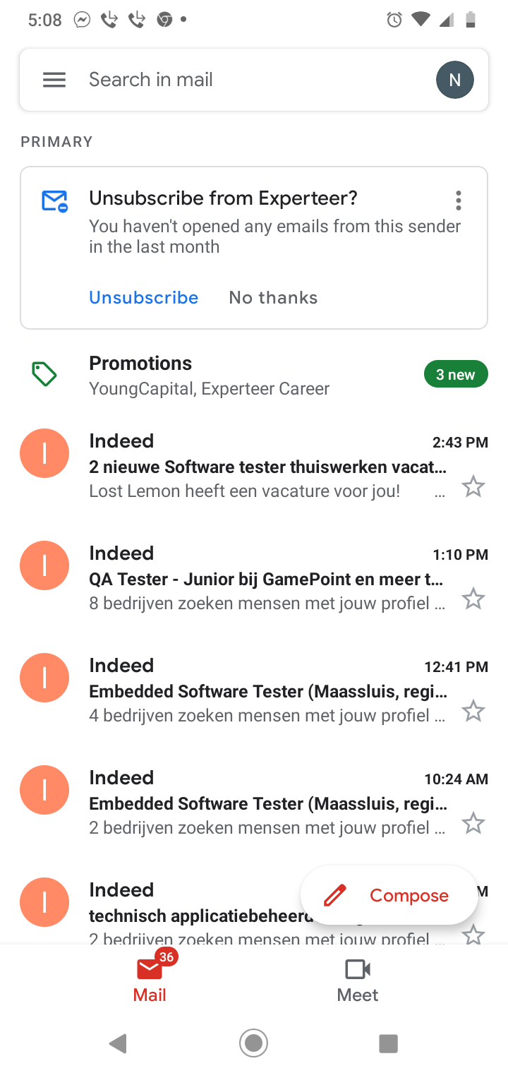
Some operators ask about header placement—putting the unsub link at the top of the email, reasoning that transparency builds trust. Gmail’s one-click unsubscribe feature (which surfaces a prominent “Unsubscribe” button at the top of the interface) made this conversation louder in early 2024, but that feature pulls from the List-Unsubscribe header in your email’s metadata, not from visible link placement in your HTML.
Moving your visible unsubscribe link to the email header doesn’t improve deliverability. It just makes it easier for casual readers to bail before they’ve read anything. The data from operators who’ve tested this consistently shows higher unsub rates with no measurable improvement in engagement from the readers who stay.
How spam filters read unsubscribe placement
Inbox providers—Gmail, Outlook, Yahoo—look for two signals: a visible unsubscribe link in the email body, and a List-Unsubscribe header with either a mailto or HTTPS endpoint. Both matter, but the header matters more.
When the header is present and functional, Gmail and Yahoo display their own one-click unsubscribe button. If the header is missing or broken, they rely on the visible link in your email body. If that’s hard to find—buried in a wall of fine print, styled to blend with the background, or located off-screen on mobile—spam filters flag it.
Most platforms handle the header automatically. Postmark, for example, injects a List-Unsubscribe header by default on all sends if you’ve set up suppression lists. Brevo and MailerLite do the same. If you’re self-hosting your email sends via SMTP or API, you need to add this header manually.
The visible link’s placement matters less to filters than its presence and clarity. Filters scan for the word “unsubscribe” or “opt out” in the lower third of the email. If it’s there, in a legible font size (at least 10px), you’re fine. If you hide it in an image, use a euphemism (“manage preferences” alone doesn’t count), or require multiple clicks to complete the action, you risk spam folder placement—especially on Yahoo and Outlook.
Reader behavior: bottom vs. really bottom
There’s footer placement, and then there’s footer placement. Some operators bury the unsubscribe link below their mailing address, company registration details, and three lines of legal disclaimers. Others put it directly beneath the last content block, in the same font size as the rest of the email.
The conventional wisdom says to make unsub easy but not prominent. The data backs that up. A 2025 analysis of 800+ newsletters by Inbox Collective found that emails with unsubscribe links placed within two scrolls of the main content had 12% lower spam complaint rates than emails where the link required three or more scrolls on mobile. Spam complaints—not unsubscribes—are the real deliverability killer. When readers can’t find the unsubscribe link, they hit “Report spam” instead.
If your spam complaint rate is above 0.1%, check your footer. Open your last send on a phone. Count how many swipes it takes to reach the unsubscribe link. If it’s more than two, move it up or cut the text above it.
When to customize your unsubscribe flow
Most platforms give you a one-click unsubscribe: the reader clicks the link, lands on a confirmation page, and they’re out. Some operators add a preferences page instead—offering options to reduce frequency, switch to a digest, or unsubscribe from specific content types.
This works if you have multiple send types and segments worth preserving. If you’re sending one weekly newsletter, a preferences page just adds friction. The reader who wanted out still wants out; now they’re annoyed.
The exception: if you’re seeing high unsub rates on specific campaigns but low rates overall, a preferences step lets you isolate what’s driving exits. ConvertKit and MailerLite both support custom unsubscribe pages. Set one up, track which options readers pick, and adjust your content mix accordingly.
If you’re running a free newsletter funded by sponsors or affiliates, you might be tempted to add a “Are you sure?” interstitial or an exit survey. Don’t. Every extra step increases the chance the reader hits “Report spam” instead of finishing the unsub flow. You can ask for feedback after they’ve unsubscribed—on the confirmation page—but not before.
The one thing to check this week
Send yourself a test email from your ESP. Open it on your phone. Scroll to the unsubscribe link and tap it. If the process takes more than two taps and five seconds, simplify it. Then check your spam complaint rate in your sending dashboard. If it’s above 0.08%, your unsubscribe flow is probably part of the problem.
Want more breakdowns like this? Subscribe to One Two Three Send for weekly deep dives on the tools and tactics that power solo content businesses.
Heads up — some links in this article are affiliate links. If you sign up through them, we may earn a small commission at no extra cost to you. We only recommend tools we use ourselves.