
Author: onetwothreeadmin

  • Instagram alt-text editing: how it works after you publish

    Instagram alt-text editing: how it works after you publish

    Instagram alt-text editing: how it works after you publish
    Photo: Agência Senado from Brasilia, Brazil via Wikimedia Commons (CC BY 2.0)

    Instagram lets you add alt text to every post, Reel, and Story image. Most operators either skip it entirely or fill it in once during upload and forget it exists. What fewer people realize: you can edit alt text after publication—and there are real reasons to do it.

    If you’re running a content-driven business on Instagram, alt text isn’t just an accessibility feature. It’s indexable metadata that can surface your posts in search, and it’s a second chance to clarify context when a caption doesn’t tell the full story.

    How to edit alt text after you’ve published

    Open the post. Tap the three-dot menu in the top right. Select Edit. At the bottom of the screen (below the caption field), you’ll see Advanced Settings. Tap it. Scroll down to Alt Text. Tap Write Alt Text, edit the field, and save.

    The interface hasn’t changed much since Instagram added manual alt text in 2018, but it’s still buried two taps deeper than caption editing. That’s deliberate—Instagram auto-generates alt text using object recognition, and most users never touch it.

    For operators, though, the auto-generated version is almost always too generic. A product photo might get tagged as “image may contain: indoor, table, object” when what you actually posted was a course workbook mockup on a desk. The difference matters for search discoverability and for screen-reader users.

    When to go back and edit alt text

    Three scenarios where editing after publication makes sense:

    You published in a rush and skipped it. Common when you’re posting from mobile during a launch or event. Circle back within 24 hours—Instagram’s ranking window for Explore and hashtag feeds is short, but search indexing is ongoing.

    The post is evergreen and still getting impressions weeks later. If a carousel or single image keeps showing up in your top posts by reach, adding better alt text can extend its shelf life in search. Check your Instagram Insights for posts with long tails—anything still pulling 100+ impressions per week after 30 days is worth revisiting.

    You’re repurposing content across platforms and want consistent metadata. If you cross-post to Facebook (which shares alt text fields), Pinterest, or LinkedIn, editing Instagram’s alt text keeps your asset library uniform. Especially useful if you’re using a scheduler like Publer that can carry alt text forward into future posts.

    One non-obvious gotcha

    Instagram doesn’t timestamp alt text edits, and it doesn’t notify followers when you change it. That sounds convenient—no “edited” label like you get on captions—but it creates a tracking problem.

    If you’re running tests (say, comparing generic vs. descriptive alt text on product posts), you can’t tell from the Instagram app when you made the change. The edit is invisible in your activity log. If you’re A/B testing alt text impact on reach, you need to log the change externally—spreadsheet, notes app, or a dedicated social media tracker.

    This also means you can’t reverse-engineer what alt text a competitor used if they’ve edited it. You only see the current version. If you’re researching how other operators optimize for Instagram search, screenshot the alt text the first time you see a post, because it might not be there next week.

    What to write (and what to skip)

    Alt text should describe what’s in the image, not repeat your caption. Instagram’s guidance says 100 characters or fewer, but the field accepts up to 300. Screen readers handle long alt text fine, but search indexing seems to weight the first 100–125 characters more heavily based on anecdotal testing from accessibility-focused operators.

    Skip hashtags, emojis, and brand slogans. Don’t write “Photo of…” or “Image shows…”—screen readers already announce it’s an image. Just describe it: “Laptop on desk with coffee mug and open notebook” beats “Image may contain: electronics, beverage, indoor.”

    If the image contains text (quote graphic, announcement, tutorial screenshot), transcribe the key text in the alt field. Instagram’s auto-recognition doesn’t do OCR reliably, so “Launch day: 300 subscribers in 48 hours” is better alt text than “text, screenshot.”

    For carousels, you write separate alt text for each image. Tap into edit mode, swipe to the image you want to describe, open Advanced Settings, and write the alt text for that slide. It’s tedious for 10-slide carousels, but if you’re repurposing a carousel as a lead magnet or using it in ads later, front-loading that work pays off.

    Does it actually affect reach?

    Instagram has never confirmed that alt text is a ranking signal for Explore or hashtag feeds. But it’s confirmed that alt text feeds into search—both the general search bar and the newer keyword search that rolled out in 2024. If someone searches “newsletter dashboard screenshot” and your alt text says exactly that, you have a better shot at surfacing than if Instagram auto-tagged it as “screenshot, text, computer.”

    Anecdotally, operators who’ve back-filled alt text on 50+ evergreen posts report small upticks in profile visits from search—5–10% over 60 days. Not explosive, but enough to make it worth 15 minutes of cleanup work.

    More importantly, it’s a file-keeping habit that saves time later. If you ever export your Instagram content (for a portfolio, a website gallery, or a course), having real alt text instead of auto-generated garbage makes the migration cleaner.

    Want this in your inbox? One Two Three Send breaks down one tool, tactic, or workflow decision every day—no fluff, just what works for operators running online businesses. Subscribe at the top of the page.

    Heads up — some links in this article are affiliate links. If you sign up through them, we may earn a small commission at no extra cost to you. We only recommend tools we use ourselves.


  • Productivity workflow automation: when triggers fire twice

    Productivity workflow automation: when triggers fire twice

    Productivity workflow automation: when triggers fire twice
    Photo by Sasun Bughdaryan on Unsplash

    You set up a Zapier workflow to save new Stripe customers into your CRM. Two hours later, you’ve got 14 duplicate contacts and three confused replies from customers who received the same welcome email twice.

    Automation platforms let you wire together dozens of tools without writing code, but they rarely warn you when two triggers point at the same event. The result: workflows that fire twice, charge twice, or create phantom records you’ll spend hours cleaning up.

    Here’s how to spot the problem before it compounds, and what to do when you’ve already built a mess.

    Why triggers fire more than once

    Most automation platforms treat every integration as stateless. They don’t know—or care—if another workflow is already watching the same event. If you build one Zap that triggers on “new Stripe payment” and another that triggers on “new Stripe customer,” both will fire when someone buys for the first time. Same payment, two workflows, double the side effects.

    The overlap gets worse when you use multi-step platforms. A workflow might trigger on “new ConvertKit subscriber,” add them to a Google Sheet, then use that sheet row as a trigger for a second workflow. If the sheet-update step retries due to a rate limit or API timeout, the second workflow fires again.

    Webhook-based triggers are even messier. If your endpoint returns a 500 error, most platforms retry the webhook three to five times over the next hour. Each retry can spawn a new workflow run unless you’ve implemented idempotency checks—and most solo operators haven’t.

    Where to look for duplicate triggers

    Open your automation platform and list every active workflow. Group them by trigger type: “new email subscriber,” “payment received,” “form submitted,” “spreadsheet row added.” If two workflows share the same trigger event but act on different downstream steps, you’ve got overlap risk.

    Check your CRM, spreadsheet, or database for duplicate records created within seconds of each other. Sort by timestamp. If you see the same email address, order ID, or name appearing twice with a five-second gap, you’re looking at a double-trigger.

    Look at your email logs. Platforms like Postmark and Brevo show you every message sent, including duplicates. If a single transaction triggered two identical emails, trace backward to the workflow that sent them.

    Review your payment processor’s event log. Stripe, Lemon Squeezy, and PayPal all timestamp webhook deliveries. If you see the same charge.succeeded event delivered twice to your automation platform, and both deliveries returned HTTP 200, the fault is in your workflow logic—not the webhook.

    How to fix it without rebuilding everything

    Add a deduplication step at the start of every workflow. Most platforms let you query a database or spreadsheet to check if a record already exists. In Zapier, use a “Lookup Spreadsheet Row” or “Find Record” action before you create anything new. If the lookup returns a match, stop the workflow.

    Use a dedicated idempotency table. Create a Google Sheet or Airtable base with two columns: event ID and timestamp. Every time a workflow starts, write the trigger’s unique ID (Stripe charge ID, form submission ID, ConvertKit subscriber ID) to the table. Before processing, check if that ID already exists. If it does, halt.

    Switch from polling-based triggers to webhook triggers where possible. Polling checks for new data every 5 or 15 minutes and can catch the same record multiple times if your workflow is slow. Webhooks fire once per event and include a unique event ID you can store and check.

    Set up error alerts that fire before your workflow completes. If a step fails halfway through, you want to know immediately—not after the platform retries and creates duplicates. Zapier, Make, and n8n all support email or Slack notifications on step failure.

    When to split workflows vs. merge them

    If two workflows handle different outcomes from the same trigger, merge them into a single workflow with conditional branches. Instead of one Zap for “new paying customer” and another for “new free trial signup,” build one workflow that checks the payment amount and branches accordingly.

    If your workflows act on truly separate events—new blog post published vs. new email subscriber—keep them separate. The risk of duplicate triggers is low, and merging adds complexity you don’t need.

    When a workflow grows past eight steps, consider splitting it. Long workflows are harder to debug, and a failure in step six means steps one through five run again on retry. Break complex automations into smaller workflows connected by a shared data store, and add idempotency checks at every entry point.

    Want more workflow breakdowns like this? Subscribe to One Two Three Send for operator-focused guides every week—no fluff, just the automation logic that saves you hours and prevents expensive mistakes.

    Heads up — some links in this article are affiliate links. If you sign up through them, we may earn a small commission at no extra cost to you. We only recommend tools we use ourselves.
  • Analytics custom dashboards: when pre-built templates mislead you

    Analytics custom dashboards: when pre-built templates mislead you

    Analytics custom dashboards: when pre-built templates mislead you
    Photo by Stephen Phillips – Hostreviews.co.uk on Unsplash

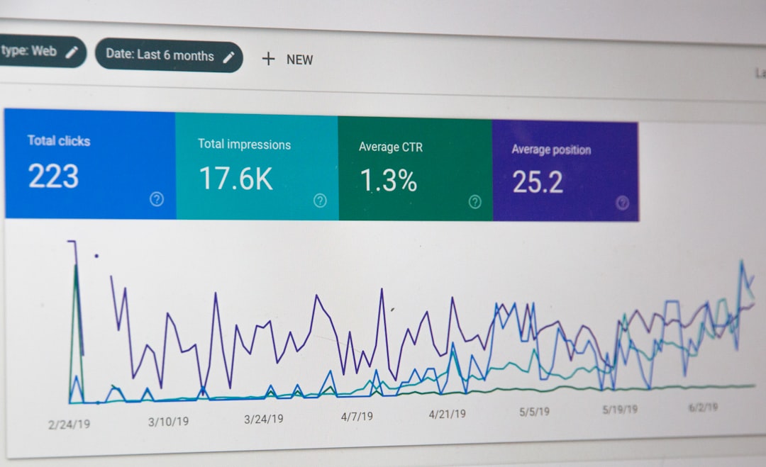
    Most analytics platforms ship with attractive templates. You connect your data source, the dashboard populates itself, and you get a grid of charts that look professional enough to screenshot for a board deck.

    The problem: those templates measure what the vendor thinks matters, not what actually drives your business. And because they look polished, operators assume they’re looking at the right metrics—until revenue stalls and the dashboard still shows green.

    What pre-built dashboards optimise for

    Analytics vendors design default templates to serve the widest possible audience. That means they prioritise:

    • Vanity metrics that trend upward. Page views, session counts, total subscribers. These make new users feel good and reduce churn during trial periods.
    • Metrics that showcase platform features. If the tool sells attribution modelling, the dashboard will surface multi-touch funnels—even if you’re a solo operator with one traffic source.
    • Industry averages that may not apply. E-commerce dashboards assume you care about cart abandonment rate. But if you sell a $2,000 course with a multi-week consideration cycle, cart behaviour is noise.

    The result: you spend every Monday morning reviewing a dashboard that tells you visits are up 12% but can’t explain why revenue per subscriber dropped.

    The metrics that actually matter depend on your model

    If you run a sponsored newsletter, your core dashboard should answer:

    • What’s my seven-day open rate by acquisition source?
    • Which posts drove the most sponsor link clicks?
    • What’s my subscriber-to-sponsor-ready ratio? (Sponsors care about engaged readers, not total list size.)

    If you sell a productised service with monthly retainers, you need:

    • Monthly recurring revenue vs. one-time project income.
    • Client lifetime value by acquisition channel.
    • Churn rate and leading indicators (missed payments, support ticket volume).

    If you monetise with affiliates and ad networks, track:

    • Revenue per thousand visitors by content category.
    • Affiliate conversion rate by product and placement.
    • Traffic source profitability after paid acquisition cost.

    None of these maps cleanly onto a Google Analytics 4 or Plausible default template. You have to build it yourself.

    When to abandon the template and start from scratch

    Here’s the test: open your current dashboard and ask, “If this metric moved 20% in either direction, would I change what I do this week?”

    If the answer is no, delete the widget.

    Then list the three business questions you asked yourself in the last 30 days. Examples:

    • “Why did last week’s post convert worse than the week before?”
    • “Which traffic source sends readers who actually buy?”
    • “Is my welcome sequence still working, or has open rate decayed?”

    Build one dashboard widget per question. If your analytics platform can’t answer it, you’re either tracking the wrong events or using the wrong tool.

    What good custom dashboards look like

    Effective operator dashboards are not beautiful. They’re a small grid—often just four to six widgets—that update weekly and drive a specific decision.

    A working example from a course creator I consulted for:

    • Widget 1: Revenue this month vs. same month last year.
    • Widget 2: Email-to-purchase conversion rate for the last four launches.
    • Widget 3: Refund rate by cohort (tracks product-market fit over time).
    • Widget 4: Traffic source breakdown for purchase-page visitors (not all visitors).

    That’s it. Four numbers. Every Monday, she knows whether to focus on traffic, conversion, or retention. The default Stripe dashboard showed gross volume and successful charges—impressive numbers that didn’t clarify what to do next.

    One dashboard, one decision

    If you’re still using a pre-built template, block an hour this week to rebuild from scratch. Start with one business question. Add only the metrics that answer it. If you can’t connect a widget to a decision you’ll make in the next 30 days, leave it out.

    The goal isn’t a dashboard that impresses a investor. It’s a dashboard that tells you what to do on Tuesday.

    What’s the one metric you check every week that actually changes how you work? Hit reply and tell me—I’m collecting examples for a deeper dive on operator-specific analytics setups.

  • Productized service revenue: forecasting retainer churn vs. new bookings

    Productized service revenue: forecasting retainer churn vs. new bookings

    Productized service revenue: forecasting retainer churn vs. new bookings
    Photo by Invest Europe on Unsplash

    If you run a productized service—content writing packages, design retainers, SEO audits sold monthly—you’ve probably built a revenue forecast that looked great in January and fell apart by March.

    The culprit: most operators model new bookings but treat churn as an afterthought. You add projected monthly recurring revenue from new clients, assume everyone renews, and wonder why actual cash is 20% lower than the spreadsheet promised.

    Retainer businesses don’t grow linearly. They grow in steps, then lose a piece, then step again. Forecasting both movements—accurately—requires separating the two flows and tracking them with different assumptions.

    Why churn breaks simple revenue models

    A typical productized service forecast starts with current MRR, adds expected new clients at your average package price, multiplies by twelve months, and calls it done.

    But retainer churn isn’t binary. Clients don’t all leave at once—they trickle out. A $2,000/month design retainer might churn in month four. A $500 content package might renew for eight months, then pause for two, then restart at $300.

    If you’re forecasting new bookings at $10,000 MRR per month and losing $3,000 to churn every month, your net growth is $7,000—but most forecasts show $10,000 because churn is invisible until it happens.

    The fix: track gross new MRR and gross churn MRR separately, then calculate net monthly change. This gives you three numbers instead of one, and it exposes whether you’re growing because you’re selling well or just because churn hasn’t caught up yet.

    Model churn as a monthly percentage, not a yearly average

    Annual churn rate—say, 25%—sounds manageable. But if you apply it evenly across twelve months, you’re assuming the same clients leave every period. That’s not how retainers work.

    Clients churn in clusters: budget resets in January, mid-year strategy shifts in June, end-of-contract renewals in December. If you sell a six-month retainer, churn spikes in month seven. If you sell annual packages, churn concentrates around renewal month.

    Instead of spreading 25% annually, model churn month-by-month based on contract length. If 40% of your clients are on six-month retainers, expect churn to spike every six months. If 30% are month-to-month, expect steady 5–8% monthly churn from that cohort.

    Build a simple table: cohort start month, contract length, expected churn month. Then sum churn by month. It’s more work than a single percentage, but it prevents the surprise of losing $8,000 MRR in one week because five contracts ended simultaneously.

    Forecast new bookings with a confidence tier

    New bookings aren’t certain until the invoice is paid. But most revenue forecasts treat pipeline conversations the same as signed contracts.

    Separate your bookings forecast into three tiers: signed and started (100% confidence), contract sent and verbally agreed (60–70%), active proposal or discovery call scheduled (20–30%). Multiply expected MRR by the confidence weight, then sum across tiers.

    This gives you a weighted pipeline value instead of a binary “we’re closing five clients this month” guess. If you have $15,000 in signed MRR, $8,000 in sent contracts, and $12,000 in proposals, your weighted new MRR is $15,000 + ($8,000 × 0.65) + ($12,000 × 0.25) = $23,200, not $35,000.

    Update the weights weekly. If your “sent contract” close rate is actually 80%, raise the multiplier. If proposals convert at 15%, lower it. The model gets more accurate the longer you run it.

    Track the gap between bookings and cash received

    Retainer invoices don’t always pay on time. A $3,000/month client might sign in August, start work in September, and pay the first invoice in October. Your MRR went up in August, but cash flow didn’t move until October.

    Separate your forecast into two views: MRR booked (when the contract starts) and cash received (when payment clears). The gap between them is your working capital need.

    If you’re booking $10,000 new MRR per month but cash lags 30 days behind, you need $10,000 in the bank to cover the gap. If half your clients pay net-30 and the other half pay upfront, the gap shrinks to $5,000—but it’s still there.

    Most productized service operators don’t track this until they can’t make payroll. Build it into the forecast from the start: MRR booked this month, expected cash next month, any overdue invoices dragging into month three.

    One spreadsheet, three tabs

    You don’t need expensive forecasting software. A Google Sheet with three tabs works: one for new bookings (weighted pipeline), one for churn by cohort and contract length, one for net MRR and cash flow.

    Update bookings weekly. Update churn monthly when contracts renew or cancel. Compare forecast vs. actual every month and adjust your confidence multipliers and churn rates based on what actually happened.

    The forecast won’t be perfect. But it’ll be close enough to catch a cash crunch two months out instead of two weeks out—and that’s the difference between scaling smoothly and scrambling to replace a lost retainer overnight.

    Want more operator-focused breakdowns like this? Subscribe to One Two Three Send—we publish daily guides on tools, workflows, and monetisation for people running online businesses.

  • WordPress maintenance mode locks out admins—here’s why

    WordPress maintenance mode locks out admins—here’s why

    WordPress maintenance mode locks out admins—here's why
    Photo by Mike Szczepanski on Unsplash

    You activate a WordPress plugin update, see the “briefly unavailable for scheduled maintenance” message, and refresh a minute later expecting your dashboard. Instead, you’re staring at a blank maintenance page—with no login link, no bypass, and no way back in.

    This isn’t a hypothetical edge case. Maintenance mode lockouts happen when a plugin update stalls, a server timeout interrupts file writes, or a third-party maintenance plugin misconfigures its access rules. The site enters maintenance mode, but the cleanup script that’s supposed to disable it never runs.

    Here’s what actually happens, when you’re at risk, and how to fix it without SSH or panic.

    What triggers WordPress maintenance mode

    WordPress core uses a file called .maintenance in your site’s root directory to signal that updates are in progress. When you trigger a plugin or theme update from the dashboard, WordPress writes this file, runs the update, then deletes the file. The entire process usually takes 10–30 seconds.

    If something interrupts that flow—a PHP timeout, a failed database query, a hosting firewall rule that kills long-running requests—the .maintenance file stays in place. WordPress reads it on every page load and shows the maintenance message instead of your site.

    Crucially, this affects admin URLs too. The maintenance check happens before WordPress loads wp-admin, so even /wp-login.php returns the same generic holding page. No login form. No dashboard. No escape hatch.

    When third-party maintenance plugins make it worse

    Plugins like WP Maintenance Mode and Coming Soon Page add their own maintenance layers. They write database options or create custom .maintenance files with extended logic. Some let you whitelist IP addresses or set a bypass secret; others don’t.

    The problem: if you activate one of these plugins and misconfigure the access rules—or if the plugin conflicts with a caching layer—you can lock yourself out without triggering a core WordPress update at all. The plugin’s maintenance screen overrides everything, including admin access, and you’re left guessing which file or database row is responsible.

    How to recover access in under five minutes

    If you’re locked out, you need file-level access. Most shared hosting control panels (cPanel, Plesk, Flywheel, BigScoots) include a file manager. Open it, navigate to your WordPress root directory (usually public_html or www), and look for .maintenance. Delete it. Refresh your site. You’re back in.

    If the lockout persists, a plugin is holding the maintenance state. Connect via SFTP or file manager and rename the plugin’s folder inside /wp-content/plugins/. WordPress will deactivate it automatically. If you don’t know which plugin caused it, rename the entire plugins folder to plugins-off, log back in, then rename it back and reactivate plugins one at a time.

    For sites using object caching (Redis, Memcached), flush the cache from your hosting dashboard or via WP-CLI. Cached maintenance flags sometimes outlive the .maintenance file itself.

    One non-obvious tip: set a cron failsafe

    If you run a solo site or small team operation, add a cron job that deletes .maintenance files older than five minutes. Most hosting control panels let you schedule shell commands. A one-liner like find /path/to/wordpress -name .maintenance -mmin +5 -delete prevents lockouts from becoming multi-hour emergencies.

    For managed WordPress hosts that don’t expose cron directly, some monitoring services (like UptimeRobot or Oh Dear) can trigger webhook alerts when your site returns a maintenance header for longer than expected. You won’t auto-recover, but you’ll know within minutes instead of discovering it when a reader emails you.

    Maintenance mode is a necessary safety mechanism, but it’s designed for automated workflows—not manual bailouts. The faster you recognize a lockout, the less downtime you’ll eat.

    Want more WordPress infrastructure breakdowns? Reply with the hosting gotcha that cost you the most downtime—we’ll cover it in a future issue.

  • ConvertKit form embed scripts slow page speed—here’s the fix

    ConvertKit’s inline and modal form embeds ship with synchronous JavaScript that blocks page rendering. On a fast server, the delay is under 200ms. On mobile connections or slower hosts, it can push Largest Contentful Paint past the 2.5-second threshold Google uses for Core Web Vitals ranking.

    Most operators paste the embed code ConvertKit provides and never check PageSpeed Insights again. The form works, subscribers arrive, and nobody notices the render delay until traffic from search starts to flatten.

    Here’s what’s happening under the hood, and three methods to fix it without losing form functionality.

    Why the default embed blocks rendering

    When you grab a ConvertKit form embed, you get a <script> tag that points to https://f.convertkit.com/. The browser sees that script in the HTML, stops parsing the rest of the page, downloads the JavaScript file, executes it, and only then continues building the DOM.

    That’s a synchronous, render-blocking request. It happens every time someone loads the page, even if they never scroll to the form.

    ConvertKit generates the form HTML client-side with JavaScript instead of serving static markup. That choice keeps their embed code simple and lets them update form styles globally, but it trades speed for convenience.

    If your form sits above the fold—especially on a homepage or high-traffic landing page—that blocking script pushes your Largest Contentful Paint metric into the yellow or red zone. Google’s algorithm weights Core Web Vitals as a ranking signal, so the delay has SEO consequences beyond user experience.

    Method one: async attribute with intersection observer

    The fastest fix is to add the async attribute to ConvertKit’s script tag and wrap the form placeholder in a lazy-load observer. The script downloads in parallel with page rendering, and the observer only triggers the form once it enters the viewport.

    Change the default embed from:

    <script src="https://f.convertkit.com/abc123/xyz789.js"></script>

    to:

    <script async data-uid="xyz789" src="https://f.convertkit.com/abc123/xyz789.js"></script>

    Then add a small JavaScript snippet that watches for the placeholder div ConvertKit injects. Use IntersectionObserver to detect when the user scrolls near the form, then execute the embed function.

    This cuts the blocking time to near zero for users who don’t scroll to the form, and defers the render cost for those who do. PageSpeed Insights will show the improvement immediately—usually 15–30 points on mobile.

    The downside: if someone lands directly at an anchor link near your form, there’s a brief moment where the placeholder is visible before the form loads. For most use cases, that’s fine. For above-the-fold hero forms, try method two.

    Method two: static HTML with progressive enhancement

    ConvertKit’s API lets you submit form data with a plain POST request. You can hand-code a static <form> element that works without JavaScript, then layer the ConvertKit script on top for inline validation and modal behavior.

    Build a basic HTML form with fields that match your ConvertKit form ID. Set the action to https://app.convertkit.com/forms/[form_id]/subscriptions. The form submits, the user sees ConvertKit’s hosted confirmation page, and the subscriber is added.

    No JavaScript required. Zero render blocking. Core Web Vitals stay green.

    If you want inline success messages or modal behavior, load the ConvertKit script asynchronously after the page renders, and use it to enhance the static form. The form works immediately; the polish loads in the background.

    The trade-off: you lose ConvertKit’s client-side validation. You’ll need to handle error states—duplicate emails, invalid formats—on the confirmation page or with server-side logic. For simple single-field forms, that’s rarely an issue. For multi-step forms or custom fields, method three is cleaner.

    Method three: iframe embed with lazy loading

    ConvertKit also offers an iframe embed option. It’s less popular because operators worry about mobile responsiveness, but modern browsers support the loading="lazy" attribute natively.

    An iframe with loading="lazy" doesn’t download until it’s about to enter the viewport. The browser handles the lazy-load logic, so you don’t need custom JavaScript or intersection observers.

    Wrap the iframe in a responsive container—16:9 or 4:3 depending on your form height—and set width="100%". The form scales to fit mobile screens, and the iframe only loads when someone scrolls near it.

    The catch: iframe embeds add a small delay when the user does interact with the form, because the browser has to establish a separate document context. For most users, that’s imperceptible. For high-converting landing pages where every millisecond matters, test method one instead.

    Which method to use

    If your form is below the fold and you want the simplest fix, use method one: async script with an intersection observer. It’s a ten-minute change and works with all ConvertKit form types—inline, slide-in, modal.

    If you’re building a landing page where speed is the top priority and you only need email capture, go with method two: static HTML with progressive enhancement. You’ll hit perfect Core Web Vitals scores and the form degrades gracefully if JavaScript fails.

    If you’re embedding forms in blog sidebars or footer widgets where render blocking isn’t critical but you still want lazy loading, method three—iframe with loading="lazy"—is the lowest-effort option.

    ConvertKit’s default embed is fast enough for most use cases, but if you’re competing in search results where page speed is a tiebreaker, these tweaks move the needle. Run a before-and-after test in PageSpeed Insights and check your Largest Contentful Paint score. The difference shows up in hours, not weeks.

    Want more tool-specific optimization guides? Subscribe to One Two Three Send—one article every morning, no fluff, operator to operator.

  • AI tool pricing tiers: when usage caps force awkward workarounds

    AI tool pricing tiers: when usage caps force awkward workarounds

    AI tool pricing tiers: when usage caps force awkward workarounds
    Photo: Parzeus via Wikimedia Commons (CC BY-SA 4.0)

    If you run a content-driven business and use AI tools regularly, you’ve probably noticed something frustrating: pricing tiers almost never align with how you actually work.

    Most platforms—Claude, ChatGPT, Jasper, Copy.ai—bill on a monthly usage ceiling. You get X tokens, Y requests, or Z credits per 30-day cycle. Hit the limit on day 22? You wait, pay overage fees, or upgrade to a tier you don’t need 90% of the time.

    The problem isn’t the cap itself. It’s that usage rarely distributes evenly across the month. You might burn through 80% of your quota in one research sprint, then need nothing for two weeks. Or a client project lands mid-cycle and your workflow suddenly doubles.

    Here’s what actually happens when you hit the wall—and the workarounds operators use to stay productive without overpaying.

    The overage trap

    Some platforms let you exceed your tier limit and bill overages at the end of the month. Sounds flexible. In practice, it’s expensive and opaque.

    OpenAI’s API charges per-token overages at roughly 1.5× the bundled rate. If you’re on a $20/month ChatGPT Plus plan and switch to API access during a heavy week, you might see a $60 invoice with no warning. The usage dashboard updates hourly, but there’s no proactive alert before you cross into premium pricing.

    Claude‘s Pro tier ($20/month as of mid-2026) has no overage model—you just stop sending prompts until the cycle resets. That’s clearer, but it means you’re locked out at the worst possible time.

    The multi-account shuffle

    The most common workaround is also the least elegant: running multiple accounts under different email addresses.

    One operator I know keeps three ChatGPT Plus subscriptions—one under his work email, one personal, one tied to a client domain. Total cost: $60/month. He rotates between them when he hits a cap, copying context manually between browser tabs. It works, but it’s tedious and violates most terms of service if the accounts share payment details.

    For teams, the math gets messier. Claude charges $20/user/month for team plans, but usage pools don’t share across seats. If one person maxes out while another barely touches their quota, you’re paying for unused capacity. The alternative—sharing one login via a password manager—breaks collaboration features and risks account suspension.

    Prompt compression as cost control

    Another strategy: artificially shrinking input size to stretch your cap.

    Instead of pasting a full 8,000-word draft for editing feedback, you break it into 1,500-word chunks and ask the model to focus narrowly. Instead of attaching three PDFs to a research query, you extract key paragraphs and feed those.

    This works when the task is modular. It fails when context matters. If you’re asking an AI to analyze narrative consistency across a long-form article, chopping it into pieces defeats the purpose. You end up spending more tokens on follow-up clarifications than you saved upfront.

    Timing your cycles

    Some operators treat AI usage like a sprint budget. They batch heavy work—content outlines, email rewrites, research summaries—into the first week of the billing cycle, then taper off.

    This only works if your business has predictable demand. If you publish a newsletter every Monday and use AI for subject-line testing, you can schedule that early in the month. If client work arrives unpredictably, you’re stuck choosing between delaying delivery or paying for an upgrade you’ll cancel next month.

    When to upgrade vs. when to ration

    The hardest decision is knowing whether a temporary spike justifies a permanent tier jump.

    If you hit your Claude Pro cap three months in a row, upgrading makes sense. If it happened once because you onboarded a new project, paying for a higher tier ongoing is wasteful.

    Most platforms don’t offer mid-cycle upgrades that prorate cleanly. You pay the full monthly rate even if you only need the extra capacity for five days. Downgrading usually takes effect next cycle, so you’re locked in for 30 days minimum.

    The rational move: track usage manually in a spreadsheet for two months before committing to a new tier. Note when you hit caps, what triggered the spike, and whether it repeated. If the pattern holds, upgrade. If it was a one-off, accept the occasional waitlist or manual workaround.

    What actually fixes this

    A few platforms are experimenting with better models. Anthropic’s API offers pay-as-you-go billing with no monthly floor—you’re charged per token at a slightly higher rate, but you never hit a ceiling. For businesses with variable workloads, that’s often cheaper than subscribing to a tier you don’t fully use.

    Others, like Jasper, let you buy one-time credit top-ups that don’t expire. You stay on your base plan but add capacity when needed. It’s not elegant, but it’s less wasteful than upgrading for one week and forgetting to downgrade.

    The ideal pricing model for solo operators would be pooled usage with rollover—buy a bucket of tokens that lasts until you use them, regardless of calendar month. Almost no one offers this yet.

    Until they do, the best approach is honest accounting. Track what you actually use, not what you think you might need. Pay for the tier that covers 80% of your months, and accept that the other 20% will require a workaround. It’s frustrating, but it’s cheaper than staying subscribed to a plan you only need twice a quarter.

    Using AI tools in your workflow? Reply with the pricing structure that’s caused you the most friction—we’re tracking which models operators want platforms to adopt.

    Heads up — some links in this article are affiliate links. If you sign up through them, we may earn a small commission at no extra cost to you. We only recommend tools we use ourselves.
  • WordPress object cache: when persistent caching breaks your site

    WordPress object cache: when persistent caching breaks your site

    WordPress object cache: when persistent caching breaks your site
    Photo by Luke Chesser on Unsplash

    Most WordPress performance guides tell you to enable persistent object caching with Redis or Memcached. The promise: fewer database queries, faster page loads, happier visitors. The reality: if you don’t understand what WordPress caches in memory—and what shouldn’t be cached—you’ll spend hours debugging stale data, broken admin screens, and plugins that stop working.

    Persistent object caching is a feature worth using, but only if your site actually needs it and your stack can handle the edge cases. Here’s how it works, when to turn it on, and the one non-obvious setting that prevents most breakage.

    What WordPress object caching actually does

    By default, WordPress caches objects—database query results, option lookups, taxonomy terms—in PHP memory for the duration of a single page load. Once the request ends, the cache clears. Every new visitor triggers fresh queries.

    Persistent object caching extends that lifetime. Instead of storing cached data in PHP’s runtime memory, WordPress writes it to Redis or Memcached, which live outside the PHP process. The cache survives across requests, across visitors, across server restarts (until you flush it or it expires).

    For high-traffic sites, this cuts database load dramatically. A single post might generate 50+ queries on an uncached load. With object caching, most of those queries hit Redis instead of MySQL. Page generation drops from 800ms to 200ms.

    For low-traffic sites—under 10,000 monthly visits—the difference is negligible. Your database isn’t the bottleneck; network latency and unoptimized images are. Adding Redis adds complexity without measurable speed gains.

    When persistent caching breaks things

    The most common failure mode: stale data that won’t refresh. You update a post, but the homepage still shows the old title. You change a user role, but the admin menu doesn’t reflect the new permissions. You deactivate a plugin, but its settings page still appears.

    This happens because WordPress—and many plugins—assume the object cache clears between requests. They write data once, cache it aggressively, and never invalidate it. When you enable persistent caching, that assumption breaks.

    WooCommerce is notorious for this. Product stock counts, cart totals, and session data get cached with long expiration times. If your cache invalidation logic doesn’t account for stock changes, customers see inaccurate inventory. The fix: WooCommerce-specific cache groups marked as non-persistent, or a plugin like Object Cache Pro that handles WooCommerce edge cases automatically.

    Membership and LMS plugins—LearnDash, MemberPress, Restrict Content Pro—cache user permissions and course progress. If the cache doesn’t flush when a user upgrades or completes a lesson, access control breaks. You’ll get support tickets claiming “I paid but still can’t access the content.”

    The second failure mode: cache key collisions in multisite or multi-environment setups. If your staging and production sites share the same Redis instance without unique key prefixes, updating content on staging can overwrite production cache entries. Your live site serves draft content or test data.

    The non-obvious setting: cache group exclusions

    Most object cache drop-ins—Redis Object Cache, Memcached Object Cache, Object Cache Pro—let you exclude specific cache groups from persistence. These groups fall back to runtime-only caching, just like default WordPress behavior.

    The groups you almost always want to exclude:

    • counts — post counts, comment counts, term counts. These change frequently and queries are cheap.
    • plugins — plugin metadata. Caching this causes deactivated plugins to linger in memory.
    • themes — same reason. Theme switches won’t take effect until you manually flush.
    • userlogins and userslugs — user session and authentication data. Caching these across requests creates security risks.

    If you’re running WooCommerce, also exclude:

    • wc_session_id
    • wc_cart_hash
    • wc_reserved_stock

    For membership plugins, exclude any group containing “user_meta” or “permissions” in the name. Check your plugin’s documentation—most maintain a list of recommended exclusions.

    In the Redis Object Cache plugin (the most popular free option), you set exclusions via the WP_REDIS_IGNORED_GROUPS constant in wp-config.php:

    define('WP_REDIS_IGNORED_GROUPS', ['counts', 'plugins', 'themes', 'userlogins', 'userslugs']);

    Object Cache Pro uses a similar constant: OCP_IGNORED_GROUPS.

    When to actually enable persistent caching

    Turn it on if:

    • Your site gets more than 50,000 pageviews per month, or you run resource-intensive queries (complex WP_Query loops, custom taxonomies with thousands of terms).
    • Your hosting plan includes Redis or Memcached as a managed service. Most managed WordPress hosts—Kinsta, WP Engine, Flywheel—provision Redis automatically. If you’re on shared hosting or a basic VPS, setting up Redis yourself adds maintenance overhead.
    • You can test on staging first and you have a cache flush strategy. Automatic purging on post updates is table stakes; you also need manual flush access for emergencies.

    Skip it if:

    • Your site is low-traffic or you’re already using a full-page cache (WP Rocket, LiteSpeed Cache, Cloudflare). Full-page caching delivers bigger performance wins with fewer edge cases.
    • You run a membership, e-commerce, or LMS site and you don’t have time to debug cache invalidation issues. The risk of serving stale user-specific data outweighs the speed benefit.
    • Your host doesn’t offer Redis, and you’re not comfortable managing it yourself. A misconfigured Redis instance—no password, exposed port, no memory limits—is a security and stability liability.

    Want more hosting and performance breakdowns like this? Subscribe to One Two Three Send—we dig into the infrastructure decisions solo operators actually face, no enterprise fluff.

    Persistent object caching works when your site’s traffic and query complexity justify it, and when you’ve accounted for the plugins that assume caches don’t persist. If you’re enabling it just because a checklist told you to, you’re adding risk without reward.

  • SEO title tag length in 2026: Google’s display limit vs. ranking weight

    SEO title tag length in 2026: Google’s display limit vs. ranking weight

    SEO title tag length in 2026: Google's display limit vs. ranking weight
    Photo by Lukas Müller on Unsplash

    Every SEO guide tells you to keep title tags under 60 characters so Google doesn’t truncate them in search results. That advice is half-right—and the half that’s wrong costs you traffic.

    Google’s display limit and its ranking algorithm treat title tags differently. Understanding the split changes how you write them.

    What Google displays vs. what Google reads

    Google typically displays 50–60 characters of your title tag in desktop search results, slightly less on mobile. Cross that threshold and you get the ellipsis treatment: “How to Build a Newsletter Business That Actually Makes Mo…”

    But Google reads and indexes the entire title tag, regardless of length. A 90-character title won’t display in full, but every word still carries ranking weight.

    The display limit is about click-through rate. The ranking consideration is about relevance signals. They’re separate systems with separate goals.

    Most operators optimize for the wrong one. They cram primary keywords into the first 60 characters and either truncate secondary context or omit it entirely. That protects the display but weakens the signal.

    Front-load for clicks, extend for relevance

    The practical approach: write title tags in two parts.

    The first 50–55 characters are your display window. Put your primary keyword and the core promise here. Make it readable, specific, and clickable. This is what users see when they’re deciding whether to visit.

    After character 55, add secondary keywords, qualifiers, or context that strengthen the relevance signal without cluttering the visible portion. This is what Google reads when determining whether your page matches a query.

    Example for a guide on email segmentation:

    • Display-only version: “Email List Segmentation: Complete Guide for 2026” (52 characters)
    • Extended version: “Email List Segmentation: Complete Guide for 2026 | Behavioral Tags, Purchase History, Engagement Scoring” (108 characters)

    Users see the first part. Google indexes all of it. You rank for “email list segmentation,” “behavioral tags,” “purchase history segmentation,” and “engagement scoring” without sacrificing the clean display.

    When longer titles outrank shorter ones

    Longer title tags win in two scenarios.

    First, when you’re targeting multiple related keywords that share intent but use different phrasing. A 90-character title can capture “newsletter sponsorship pricing,” “how to price newsletter ads,” and “sponsor rate calculator” in one tag. A 55-character version forces you to pick one and hope the others infer.

    Second, when secondary keywords clarify scope and filter out low-intent clicks. Adding “for SaaS startups” or “without paid tools” to the end of a title tag reduces irrelevant traffic while improving relevance for the audience that matters.

    The truncation looks ugly in search results, but the ranking lift and audience filter often deliver better overall traffic and conversion than a clean 60-character tag that ranks lower and attracts the wrong visitors.

    The one case where short always wins

    Brand-new sites with low domain authority should stick to tight, focused title tags under 60 characters. You don’t have the trust signal to rank for multiple keywords per page yet, and cluttered titles dilute the primary keyword’s weight when Google is still deciding what your site is about.

    Once you’ve got a few dozen indexed pages and consistent traffic, extending strategic title tags makes sense. Until then, nail one keyword per page and keep the display clean.

    Test a handful of extended title tags on existing pages that rank between position 5 and 15. Track rank movement and CTR over 30 days. If you see a lift without CTR collapse, expand the strategy. If CTR tanks, the extended portion is pulling focus—trim it back.

    Want more tactical SEO breakdowns like this? Subscribe to One Two Three Send and get operator-focused guides in your inbox every week.

  • Newsletter referral programs: when viral loops backfire

    Newsletter referral programs: when viral loops backfire

    Newsletter referral programs: when viral loops backfire
    Photo by Kelly Sikkema on Unsplash

    Referral programs promise exponential growth: every subscriber brings two more, who bring two more, and suddenly you’re Substack’s homepage darling. The reality is messier. Badly designed referral incentives attract mercenaries hunting freebies, not readers who care about your work.

    The math looks great until you check engagement six months later and realize half your list came for a Notion template and never opened another email.

    Referral subscribers churn faster

    A newsletter operator I spoke with last month ran a referral campaign offering a paid course as the top-tier reward. Sign-ups doubled in three weeks. Open rates dropped from 48% to 31% in the same window.

    The new subscribers weren’t there for the newsletter—they were there for the prize. Once the campaign ended, 60% of referral-sourced subscribers went cold within 90 days. Organic subscribers from the same period held a 22% churn rate.

    Referral programs work when the reward aligns perfectly with what you publish. If you write about productivity and offer a productivity course, the mismatch is small. If you write about SaaS marketing and offer an unrelated design asset pack, you’ve just bought a pile of disengaged emails.

    Reward tiers create perverse incentives

    Tiered referral systems—one reward at 3 referrals, another at 10, a third at 50—encourage gaming. Operators share referral links in Facebook groups, Discord servers, and Reddit threads where context doesn’t exist. The people who click aren’t interested; they’re helping a stranger hit a quota.

    SparkLoop and other referral platforms let you set milestones, but they can’t control how someone promotes your work. I’ve seen operators hit 100 referrals in a week by spamming their link in unrelated Slack communities. Those subscribers never converted into readers, let alone customers.

    If you do run a referral program, cap the tiers low. Three referrals for a single, meaningful reward is safer than ten tiers that turn your newsletter into a multi-level marketing funnel.

    Attribution breaks when subscribers use multiple emails

    Referral tracking relies on unique links tied to individual subscriber records. When someone refers a friend who signs up with a different email than expected—or when browser privacy settings strip UTM parameters—the credit disappears.

    Beehiiv and ConvertKit both handle referral attribution natively, but neither can solve for subscribers who use email aliases, corporate addresses that auto-forward, or clients that preload links for security scanning. You’ll undercount real referrals and occasionally credit the wrong person.

    This isn’t catastrophic, but it matters if you’re manually fulfilling high-value rewards. One operator told me they spent four hours auditing referral records because two subscribers both claimed the same milestone prize, and the system showed conflicting data.

    When referral programs actually work

    Referral incentives make sense when your content has built-in shareability and your audience already talks about your work unprompted. If readers forward your emails organically, a referral program adds structure to behavior that’s already happening.

    They also work when the reward is more of what you do—bonus issues, early access, deeper analysis. That filters for people who actually want your content, not people hunting giveaways.

    Skip referral programs entirely if you’re still figuring out product-market fit, if your open rates are below 35%, or if you don’t have time to fulfill rewards within a week. A backlog of unredeemed prizes kills trust faster than slow growth ever will.

    One Two Three Send publishes daily operator tactics like this. Subscribe to get tomorrow’s piece in your inbox, or reply with the referral program mistake you won’t make twice.

    Heads up — some links in this article are affiliate links. If you sign up through them, we may earn a small commission at no extra cost to you. We only recommend tools we use ourselves.