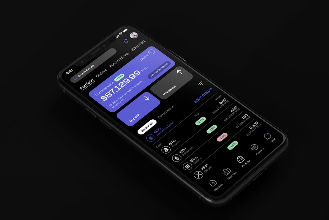
Every productivity app ships dark mode now. It’s table stakes. And for many solo operators, flipping that toggle feels like an instant upgrade—less glare, more focus, cleaner aesthetic. But dark mode isn’t a universal win, and treating it like one can quietly cost you reading speed, decision accuracy, and hours of low-grade eye strain you don’t notice until the afternoon headache arrives.
Here’s when dark mode helps, when it doesn’t, and what to watch for in the apps you use daily.
When dark mode works
Dark mode shines—literally—in low ambient light. If you’re writing at night, reviewing drafts before bed, or working in a room where you can’t (or don’t want to) turn on overhead lights, dark backgrounds reduce the amount of light your screen pumps into your retinas. That’s the core benefit: less luminance contrast between screen and environment.
It also helps with OLED screens, where true black pixels are off entirely, saving battery and reducing bloom. If you’re on a laptop with an OLED panel—common on higher-end Windows machines and some MacBook Pros—dark mode measurably extends runtime. LCD panels, which still backlight black pixels, see less benefit.
Dark mode also reduces UI glare in apps with heavy chrome—sidebars, toolbars, notification panels. If you’re jumping between browser tabs, Slack channels, and a project-management board all day, a consistent dark theme keeps the visual noise lower and the content areas more distinct.
When it costs you
The problem starts when you treat dark mode as a universal default, especially in well-lit rooms or during daytime work. Light text on dark backgrounds (positive contrast polarity, technically) is harder to read for extended periods than dark text on light backgrounds (negative contrast polarity). Your eyes have to work harder to resolve letter shapes, especially at smaller font sizes or lower contrast ratios.
This isn’t opinion—it’s physiology. The iris opens wider in low-light conditions (which dark mode simulates), letting in more light but also increasing optical aberrations and reducing depth of field. That makes fine detail—like 11pt body text in a Google Doc or a dense spreadsheet in Airtable—fuzzier. You can still read it, but you’re spending more cognitive effort on decoding and less on comprehending.
The effect compounds in apps with poor contrast ratios. Many dark themes use mid-grey text (#a0a0a0 or similar) on dark-grey backgrounds (#1e1e1e) to avoid the harshness of pure white on pure black. That’s a legibility trade-off: softer on the eyes in dim rooms, but marginal or illegible in brighter environments. If you’ve ever squinted at a task description in a project tool or re-read a Slack message three times because the words didn’t stick, check your contrast ratio. Tools like WebAIM’s Contrast Checker (checked November 2026) will tell you if your theme meets WCAG AA (4.5:1 minimum for body text) or AAA (7:1) standards.
Dark mode also hides UI state changes in some apps. Buttons, borders, and focus indicators that are obvious in light mode can vanish into dark chrome. If you’ve ever clicked “Save” twice because you weren’t sure the first click registered, or lost your cursor in a text field, that’s a dark-mode design failure—not your fault, but your problem.
Conditional dark mode: the middle path
The best setup isn’t all-dark or all-light—it’s contextual. macOS, Windows, iOS, and Android all support automatic light/dark switching based on time of day (checked November 2026 in macOS Sequoia and Windows 11 settings). Most productivity apps—Notion, Obsidian, Todoist, Superhuman, Linear—respect system preferences by default.
Set your OS to switch at sunset and sunrise, and let your apps follow. That gives you low-glare evenings and high-contrast daytime work without manual toggling. If your work hours don’t align with daylight (common for operators in multiple time zones or night-focused writers), override the schedule in system settings and pick fixed switch times that match your actual ambient light.
For reading-heavy apps—email clients, RSS readers, long-form editors—consider leaving light mode on even at night and reducing screen brightness instead. White backgrounds at 40% brightness are often easier to read than grey-on-black at 80%, especially for body text over 200 words.
App-specific switches worth making
Some apps are better in dark mode regardless of time. Code editors (VS Code, Sublime) and terminal windows benefit from dark themes because syntax highlighting—color-coded keywords and strings—pops more against dark backgrounds. If you’re writing HTML in a Markdown editor or reviewing JSON output from an API, dark mode keeps the structure clear.
Conversely, spreadsheet and database tools (Airtable, Notion databases, Google Sheets) are often better in light mode even at night. Dense grids, cell borders, and conditional formatting rely on subtle contrast differences that dark themes flatten. If you’re doing financial modeling, content planning, or any multi-column comparison work, light mode keeps the structure legible.
Writing apps are personal, but here’s the test: draft 500 words in light mode, then 500 in dark mode, same time of day, same ambient light. If you finish faster or with fewer typos in one mode, that’s your answer. Don’t let aesthetic preference override reading speed.
What to do now
Audit the apps you use for more than 30 minutes a day. Check their dark-mode contrast ratios (WebAIM link above), test them in your actual working environment (not in a dark room at 9 p.m. if you work at 9 a.m.), and switch back to light mode for any app where you notice yourself re-reading or squinting. Enable automatic switching at the OS level and override it only for apps where one mode clearly wins.
Dark mode is a tool, not a religion. Use it when it helps, skip it when it doesn’t, and stop assuming the dark toggle is always the right one.
Got a productivity setup or workflow question? Reply to any One Two Three Send email—we read everything and feature the best questions here.